A naukri.com initiative
Geeky-Gadgets
4w
361
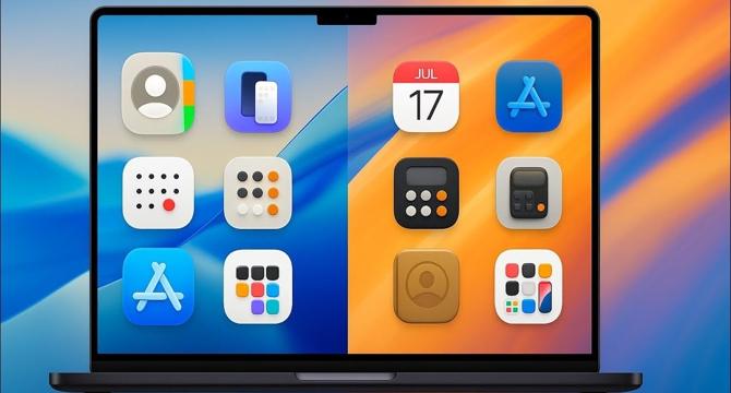
Image Credit: Geeky-Gadgets
macOS 26 Tahoe VS macOS 15 Sequoia: A Deep Dive into Apple’s Latest OS
- Apple's macOS 26 Tahoe and macOS 15 Sequoia exhibit a shift in design philosophy emphasizing a minimalist aesthetic for better user experience.
- macOS 26 Tahoe moves away from skeuomorphic design towards a flat aesthetic, aiming for visual consistency across Apple's platforms.
- The redesign of app icons in macOS 26 Tahoe results in a cleaner and more streamlined interface, enhancing usability.
- Visual updates in macOS 26 Tahoe extend beyond app icons to reshape the overall design language, creating a cohesive experience.
- By prioritizing clarity and uniformity, Apple ensures seamless interactions across tasks and system navigation.
- The redesigned icons in macOS 26 Tahoe tackle practical concerns, adapting to modern display technologies to provide a visually consistent experience.
- macOS 26 Tahoe emphasizes consistency across Apple's ecosystem, offering a unified user experience.
- The evolution of app icon design highlights Apple's commitment to aesthetics, functionality, and user experience.
- macOS 26 Tahoe boasts a minimalist and consistent design language, enhancing usability and adaptability.
- The redesigned icons result in a cleaner, more intuitive interface that aligns with Apple's ecosystem for a cohesive experience.
- macOS 26 Tahoe aims to foster visual consistency across all Apple platforms for a seamless experience for users.
Read Full Article
21 Likes
For uninterrupted reading, download the app