A naukri.com initiative
Medium
1M
352
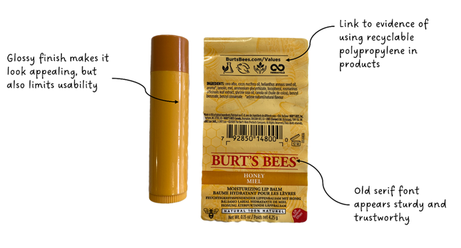
Image Credit: Medium
A callous-ed love affair with Burt’s Bees Lip Balm: a reminder that products don’t live in vacuums
- Burt's Bees Lip Balm's design evokes honesty, humility, and all-natural qualities, with its simple color palette and serif logo.
- The product, made of beeswax and plant oils, was praised for its effectiveness in soothing lips without leaving a greasy residue.
- However, a major flaw was the cap's difficulty to open, causing struggles and even callouses on the user's thumbs.
- The application of lip balm as the last step in the skincare routine led to slippery fingers, making the tight cap even more challenging.
- Design should seamlessly fit into users' routines rather than causing disruptions, highlighting the importance of user-centric design.
- Considerations for manufacturing cost, usability, and hygiene were factors in the design of the lip balm container.
- The challenging cap design raised issues of inclusivity for people with limited dexterity or grip strength.
- The article presents a call for more inclusive and affordable design solutions to address challenges like the difficult lip balm cap.
- Despite the design flaw, the author still appreciates the effectiveness of Burt's Bees Lip Balm and prefers the original formula over the Honey variant.
- The article concludes with a reflection on the importance of inclusive design and the need for continuous improvement in product experiences.
Read Full Article
21 Likes
For uninterrupted reading, download the app