UX Design
2w
395

Image Credit: UX Design
A systematic approach to generating enterprise UI color palettes
- Enterprise applications require color palettes that align with brand guidelines, meet accessibility standards, support white labeling and scale for design systems.
- The author recommends starting with an established brand color and adjusting its lightness for accessibility, then deriving additional colors for the palette.
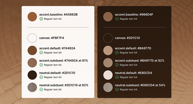
- The color palette should include a canvas color, default and subdued accent and neutral colors for light mode.
- For dark mode, invert the light mode formulas and adjust darkness and alpha to meet contrast and accessibility requirements.
- This systematic process can be extended to include semantic colors, interaction states, and address WCAG standards for text and non-text elements for complex enterprise applications.
- This approach is not just about aesthetics but solving UX challenges for scale and accessibility.
- The author points out problematic colors, including dark yellow and colors that conflict with semantic colors and notes the potential for automation.
- WCAG 3 intends to improve the flawed contrast formula of WCAG 2, but the author is unsure how this will impact the process.
- In conclusion, this article provides a clear framework for creating UI color palettes for enterprise contexts that can be used as a source of inspiration for establishing a unique strategy.
Read Full Article
23 Likes
For uninterrupted reading, download the app