A naukri.com initiative
TheDesignAir
5d
65
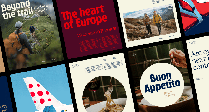
Image Credit: TheDesignAir
Brussels Airlines Redefines Its Identity with Boutique-Inspired Brand Refresh
- Brussels Airlines redefines its identity with a boutique-inspired brand refresh by partnering with Antwerp-based studio WeWantMore.
- The transformation focuses on emotion, subtle sophistication, and a 'boutique hotel in the sky' ethos, retaining core elements like the logo and color palette while adding depth and texture.
- Notable updates include a flexible dot motif, a custom typeface called Cirrus Sans, and a refined color palette for a cohesive visual language across touchpoints.
- The brand refresh is not just visual but extends to all interactions, embodying a premium yet human feel, reflecting the Belgian spirit with a playful twist.
Read Full Article
3 Likes
For uninterrupted reading, download the app