A naukri.com initiative
Nngroup
1M
185
Image Credit: Nngroup
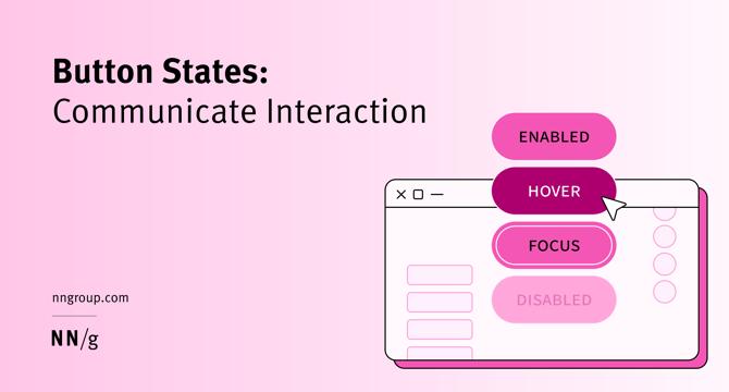
Button States: Communicate Interaction
- Minor visual changes help users distinguish between 5 different button states: enabled, disabled, hovered, focused, pressed.
- Buttons are core user-interface elements that, when clicked or tapped, execute an action.
- Clear button labels and effective signaling of button states are critical for a good design.
- The most commonly used button states are enabled, disabled, hovered, focused, and pressed.
Read Full Article
11 Likes
For uninterrupted reading, download the app