A naukri.com initiative
Logrocket
7d
104
Image Credit: Logrocket
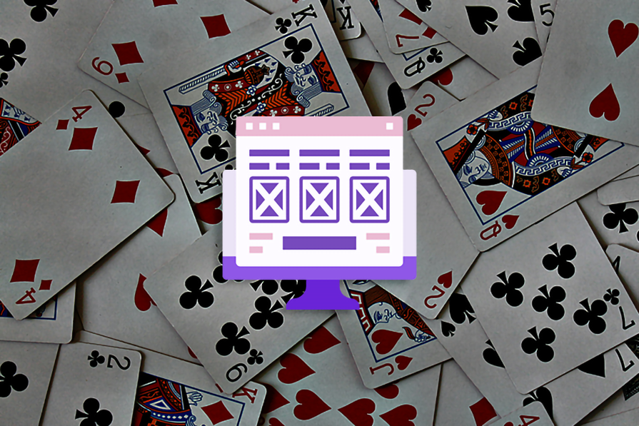
Card interface design: Tutorial, examples, and best practices
- Cards in UI design are versatile components used to organize information effectively, offering previews, featured content, and navigation options.
- A card typically consists of a header, body, and footer sections within a container, allowing for flexibility in content presentation.
- Benefits of using cards include enhanced visual appeal, improved organization, simplified navigation, and adaptability to different screen sizes.
- Cards are commonly used in ecommerce websites, social media platforms, news/blogs, and task management applications to display information in a structured format.
- When designing card UI, consider grouping similar content, maintaining alignment, and ensuring consistent spacing for clarity and readability.
- Best practices for card layouts include keeping content simple and meaningful, establishing a clear visual hierarchy, and using a consistent layout for a cohesive user experience.
- Key examples of successful card interface designs include Apple TV+, Balatro game app, and Trello, each showcasing unique features and functionalities.
- Common pitfalls in card design to avoid include cluttered content, inconsistent grids, poor color contrast, and lack of responsiveness.
- Card-based user interfaces are widely used in media platforms, social media, online shopping, project management, educational platforms, news websites, and more for enhanced usability and organization.
- By following best practices and avoiding common pitfalls, designers can create visually appealing and user-friendly card interfaces that enhance the overall user experience.
Read Full Article
6 Likes
For uninterrupted reading, download the app