A naukri.com initiative
Dev
3w
52
Image Credit: Dev
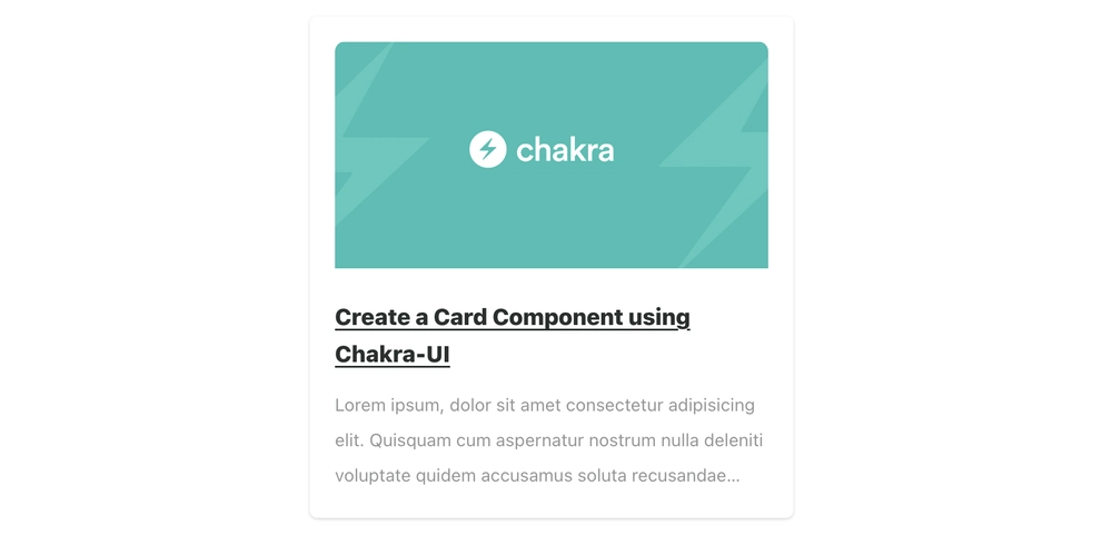
Create a Card Component Using Chakra-UI
- Creating beautiful user interfaces in simple and stress-free ways with Frontend Engineering has been a focus lately, and Chakra-UI aids in building faster and simpler components.
- Chakra-UI is a simple, modular, and accessible component library for building React applications efficiently, saving time on UI code and enhancing user experiences.
- Benefits of using Chakra-UI include accessibility, customizability, lightweight structure, compatibility with other libraries, detailed documentation, and flexibility in component usage.
- Chakra-UI can be installed automatically through Create React App with templates or manually by installing specific packages within a project.
- After installing Chakra-UI, setting up the ChakraProvider at the root of the application provides access to its features and dependencies throughout the project.
- Building a card component involves using Chakra-UI components like Card, Stack, Heading, Image, Text, and Link to create a visually appealing and functional card.
- The provided code snippets demonstrate setting up Chakra-UI and building a card component to display basic information like image, title, and text in a React project.
- By centralizing the rendered card component on the screen, the final result showcases a clean and visually appealing card using Chakra-UI.
- Chakra-UI simplifies frontend development, enabling engineers and companies to ship products faster and enhance overall productivity.
- For more detailed explanations and further learning about Chakra-UI and its components, refer to the official documentation and related resources provided.
Read Full Article
3 Likes
For uninterrupted reading, download the app