A naukri.com initiative
Designhill
1w
419
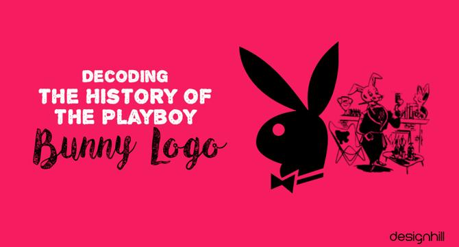
Image Credit: Designhill
Decoding the History of the Playboy Bunny Logo
- The Playboy logo, featuring the iconic bunny design, has played a significant role in establishing the brand's identity over the years across various merchandise and publications.
- Originally, the term 'Playboy Bunny' was used for waitresses at Playboy Clubs who wore distinctive bunny costumes, symbolizing elegance and allure.
- The Playboy Bunny logo, designed by Art Paul in 1953, underwent simplification to create a more recognizable and elegant symbol for the brand.
- Key elements of the logo, such as the bunny figure, bow tie, bold font, and color choices, were strategically chosen to convey sophistication and elite class associated with Playboy.
- Hugh Hefner explained that the choice of a rabbit as the logo symbolizes freshness, vivacity, and sensuality, aligning with the Playboy image.
- The rabbit in the logo also represents desire, vulnerability, and comfort, reflecting the essence of the Playboy brand.
- The bow tie in the logo signifies class and sophistication, adding to the refined lifestyle image Playboy aimed to portray.
- The black color of the Playboy logo symbolizes authority, success, and simplicity, with occasional variations like pink or red for marketing purposes.
- The Playboy logo has maintained its original design since 1953, with the bunny motif retaining its influence on logo design across industries.
- The evolution of the Playboy bunny logo exemplifies a transition from complexity to simplicity, representing the brand's sensuous identity globally.
Read Full Article
25 Likes
For uninterrupted reading, download the app