Department of Product
1M
140

Image Credit: Department of Product
Deep: Navigation UX patterns explored
- SaaS product Retool redesigns it's navigation strategy to improve its conversion rate.
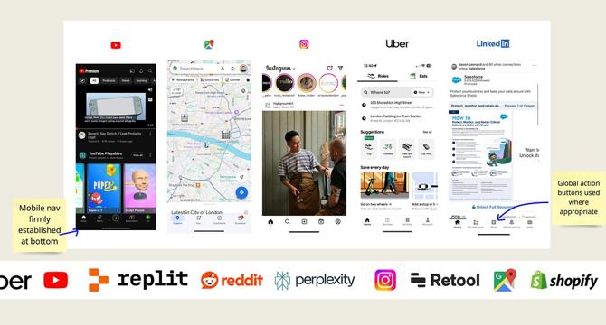
- This deep dive explores the navigation styles and UX patterns of over 20 top tier companies.
- Different types of navigational styles like megamenus, global switches, fly-outs and click toggles are elaborated in the analysis.
- The study for this analysis reveals that well-designed navigation can result in a significant 37% improvement in task completion rates.
- Notable navigation designs of companies like Uber, Notion, Replit, YouTube, Reddit, Retool and others are studied to reveal useful tactics for creating modern UI designs.
- The analysis reveals that upsell of products, use of carousels and blurring effects are currently popular and effective UI trends being used by companies.
- The companies covered in the analysis are a broad cross-section of different product types including SaaS, workplace productivity, ecommerce, consumer software, AI, media and publishing and fintech.
- For each company covered, detailed screen grabs of their UIs that have been studied are available for users to download and keep a copy.
- This deep dive should be helpful for those who are considering making changes to their navigation to optimise their product conversion rates and create more effective UI designs.
- Well-known companies like Uber, YouTube, Dropbox, New York Times and Linear have implemented unique navigation styles worth exploring.
Read Full Article
8 Likes
For uninterrupted reading, download the app