Feedspot
1w
47

Image Credit: Feedspot
Discrete vs Continuous Data Distributions: Which One to Use?
- Understanding data distributions is crucial for better data analysis and making informed decisions.
- Discrete vs continuous data distribution plays a key role in understanding the behavior of data and how to analyze it.
- Data distribution describes how points in a dataset are spread across different values or ranges, and mapping data points provides a clear picture of the data’s behavior.
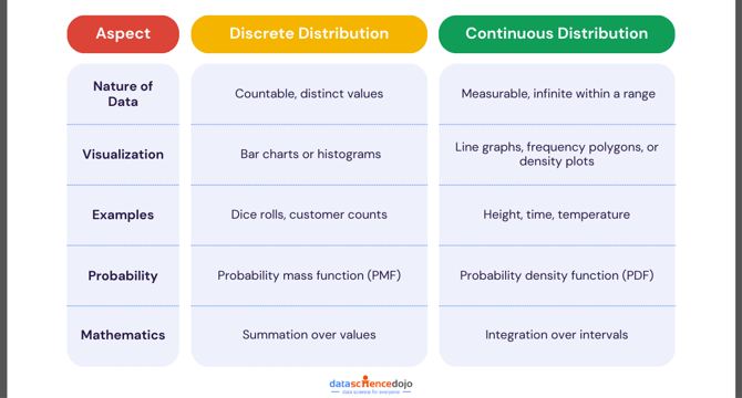
- Discrete data consists of distinct, separate values that are countable and finite, while continuous data consists of values that can take on any number within a given range.
- Common examples of discrete data distributions include binomial, geometric, and Poisson, while continuous data distributions include normal, exponential, and Weibull.
- Discrete data is best represented using bar charts or histograms, while continuous data is best represented using line graphs, frequency polygons, or density plots.
- Understanding the type of data distribution is crucial for selecting the right statistical tests and tools, which can lead to more accurate predictions and better models.
- Data types have practical applications in various business areas, such as customer behavior analysis, marketing campaigns, and financial forecasting.
- Knowing your data type and distribution is the foundation for accurate analysis, effective decision-making, and successful business strategies.
- By mastering discrete and continuous data distributions, you can choose the right methods to uncover meaningful insights and make data-driven decisions with confidence.
Read Full Article
2 Likes
For uninterrupted reading, download the app