A naukri.com initiative
Dev
4w
419
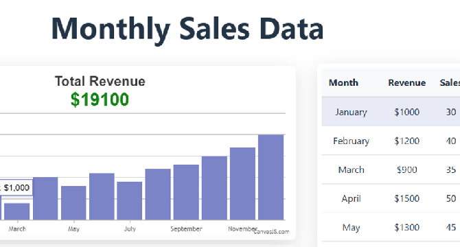
Image Credit: Dev
Enhancing Sales Data Visualization: Advanced Interactivity with CanvasJS and React Table
- This article builds upon the foundation laid in my previous piece, 'Visualizing Sales Data with CanvasJS and React Table', where we explored the basics of setting up a sales dashboard using @tanstack/react-table and @canvasjs/react-charts.
- Now, we'll take it a step further by diving into advanced interactive features—row highlighting in tables and dynamic tooltips in charts—to create a more engaging and user-friendly experience.
- Features like row highlighting and interactive tooltips provide visual cues and additional context, making the data more accessible without overwhelming the user.
- These enhancements will help users better navigate and analyze sales data, making the dashboard not just a display tool but an interactive exploration platform.
Read Full Article
25 Likes
For uninterrupted reading, download the app