A naukri.com initiative
UX Design
1M
210
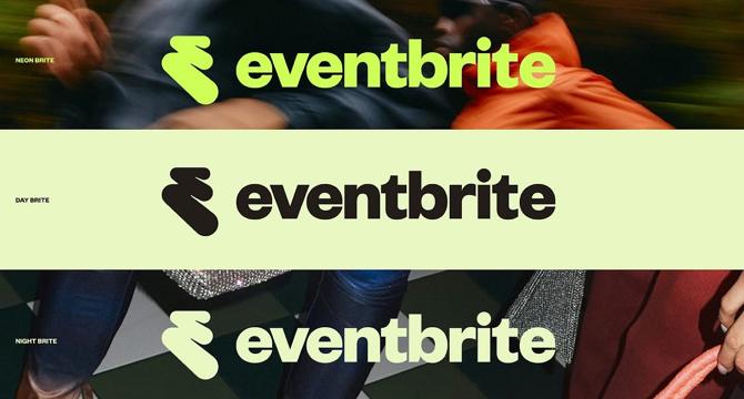
Image Credit: UX Design
Eventbrite’s bold rebrand: how ‘The Path’ reinvents its visual identity
- Eventbrite has undergone a rebranding to reflect the energy of live experiences and adapt to new user expectations in the digital landscape.
- The rebrand balances innovation and familiarity, embodying a fresh direction while maintaining recognizable design principles.
- Eventbrite's refreshed visual identity combines modern aesthetics with the dynamism of live events, reinforcing core values and adapting to new expectations.
- The new logo, named 'The Path,' signifies a significant transformation towards embodying the journey of engagement with live events.
- Beyond aesthetics, the rebrand aligns with Eventbrite's mission of fostering community and deeper participation in live events.
- The new logo by Buck introduces a more fluid, modern approach, emphasizing the transition from discovery to participation and shared stories.
- Eventbrite's bold typography choice and vibrant color palette aim to capture the excitement and energy of live events, enhancing brand visibility.
- The rebrand reflects deeper shifts in the company's trajectory, focusing on movement and anticipation, with a flexible logo designed for various formats.
- The updated app by Eventbrite, in collaboration with Instrument, offers AI-driven recommendations and friend coordination tools for a more immersive user experience.
- Overall, Eventbrite's rebrand with 'The Path' signifies a move towards deeper connections and experiences in the events industry, reinforcing its commitment to staying relevant.
Read Full Article
12 Likes
For uninterrupted reading, download the app