Dev
4w
261

Image Credit: Dev
Figma for developers: Figma Styles, Typography and Variables
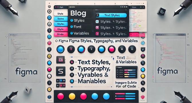
- Figma styles are reusable design properties that can be applied across multiple elements to maintain consistency across a design.
- Text styles allow you to define reusable font settings such as size, weight, line spacing, and letter spacing in Figma for developers.
- Variables function like CSS variables in Figma for developers. They are used to store reusable values, such as colors, sizes, or spacing, that can be applied across multiple elements of a design.
- Updating a style or variable on Figma reflects the changes everywhere that style or variable is used, ensuring consistency and saving time.
- Figma for developers offers keyboard shortcuts for style management that can significantly speed up workflow, making them easier to maintain consistency and apply styles across the design system efficiently.
- Using Figma styles, typography, and variables makes it easy for developers to manage and update design elements at scale, ensuring a smooth, efficient workflow.
- In the next post, Figma Components—another powerful feature that allows developers to create reusable UI elements that adapt to various design needs—will be explored.
- Maintaining consistency through styles, typography, and variables is critical for a professional and polished look of a project design on Figma.
- Reusing design elements on Figma reduces the need for manual updates across different design screens.
- In Figma, reusing the primary button color across the project can be done by creating and applying a color style.
Read Full Article
15 Likes
For uninterrupted reading, download the app