A naukri.com initiative
Towards Data Science
1M
109
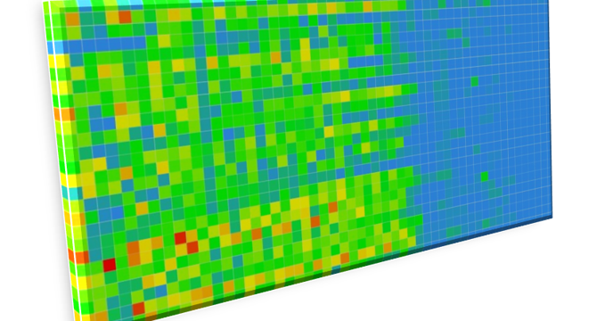
Image Credit: Towards Data Science
Heatmaps for Time Series
- The article discusses creating heatmaps for time series data using Matplotlib in Python.
- The data used in the article is related to measles cases from University of Pittsburgh’s Project Tycho.
- The article demonstrates how to visualize measles incidence data over time using pcolormesh() function in Matplotlib.
- Different heatmap functions like imshow() in Matplotlib are compared for creating visualizations.
- The article highlights the importance of color selection in creating informative and visually appealing heatmaps.
- It explains how color distribution in the heatmap can affect the interpretation of data.
- The process of creating a custom colormap in Matplotlib to match a specific heatmap design is detailed.
- The article discusses handling missing data and normalizing values for heatmap visualization.
- Heatmaps are described as effective tools for analyzing trends, temporal patterns, and communicating complex data effectively.
- They are valuable for comparative analysis, temporal trends, pattern recognition, and facilitating clear communication of data.
Read Full Article
5 Likes
For uninterrupted reading, download the app