A naukri.com initiative
Logrocket
1M
447
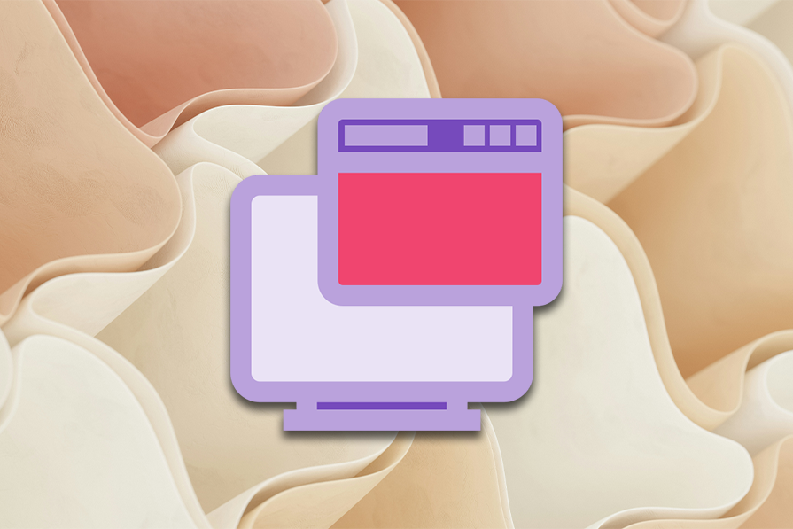
Image Credit: Logrocket
How T-layouts enhance mobile and responsive web design
- T-layout design enhances mobile and responsive web design by keeping navigation always within reach, providing a seamless user experience.
- Key features of a T-layout include a fixed horizontal section for navigation and a vertical section for main content, resembling a T.
- The T-layout must maintain a fixed horizontal section to retain its T shape, distinguishing it from traditional UI layouts.
- Some websites implement an upside-down T-layout with the navigation controls positioned at the bottom for improved accessibility.
- Benefits of T-layout design include faster navigation, improved mobile usability, reduced cognitive load, and enhanced user decision-making.
- T-layout designs are beneficial for content-heavy platforms, mobile-first applications, and web apps requiring persistent navigation.
- Not all websites require a T-layout, as its effectiveness depends on factors like target audience, content structure, and interaction requirements.
- A well-executed T-layout design can simplify website usage, improve mobile experience, and enhance user engagement.
- In conclusion, while not every website needs a T-layout, it proves to be useful for enhancing navigation, usability, and user experience in various digital products.
Read Full Article
26 Likes
For uninterrupted reading, download the app