A naukri.com initiative
UX Design
1M
434
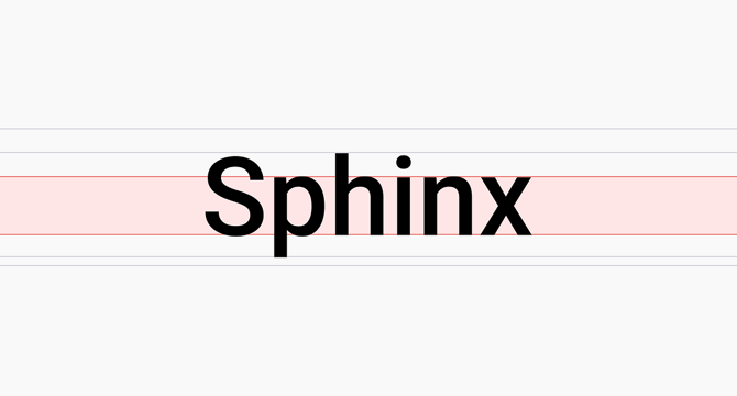
Image Credit: UX Design
How to be strategic when picking a typeface
- When picking a typeface strategically, consider factors like x-height ratio, top-to-bottom leading ratio, spatial efficiency, shape, and language support.
- X-height ratio, referring to the height of lowercase letters in a typeface, impacts legibility, particularly on screens and digital interfaces.
- An optimal x-height falls around 0.3° of visual arc for readability, with a lower threshold at approximately 0.2°.
- A higher x-height improves readability on small screens, but exceeding a certain threshold can make text harder to read and affect the typeface's character.
- Maintaining a minimum x-height ratio above 49% for legibility at closer viewing distances is recommended, with 52% providing a better balance.
- Top-to-bottom leading ratios impact how text sits within containers, with smaller ratios creating more balanced vertical spacing.
- Spatial efficiency of fonts can vary, with some occupying less horizontal space, allowing more information to fit in the same layout.
- Character differentiation and clear distinctions in letterforms improve legibility, especially for similar characters like 'O' and '0'.
- Numbers play a crucial role in interfaces, with considerations like monospaced numbers, consistent width across weights, and efficient use of space for numerical data.
- Different fonts offer varying multilingual support, so it's important to select a typeface based on the language systems required for the product.
Read Full Article
26 Likes
For uninterrupted reading, download the app