A naukri.com initiative
Medium
1w
87
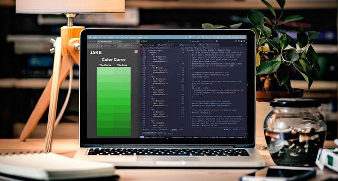
Image Credit: Medium
I Built a Thing (And It Might Just Save Your Color Palette)
- The author, a UI/UX Frontend Developer, discusses the journey of building a color tool despite being partially color blind.
- This tool aims to solve issues with muddy colors often encountered in color theory and design systems.
- The challenge of retaining color crispness while adjusting tints and shades inspired the creation of this tool.
- The tool uses a unique approach involving exponential growth and decay to maintain saturation and luminosity.
- Mathematical formulas, such as y = 1 / |x| for saturation control and (n/2) × (first number + last number) for luminance, play a key role in the tool's algorithm.
- The tool ensures colors transition smoothly towards white or black without losing their original character or readability.
- It combines elements of color theory, trigonometry, and UI design to create a balanced color palette.
- Users can download the tool on npm to experience how it maintains color consistency and saturation.
- The tool's development showcases that the best tools not only simplify tasks but also enhance them.
- The author's unique perspective on color perception contributes to creating a tool that benefits users with varied visual abilities.
- The tool's innovative approach highlights the importance of precision and balance in color design.
Read Full Article
5 Likes
For uninterrupted reading, download the app