A naukri.com initiative
BGR
2d
215
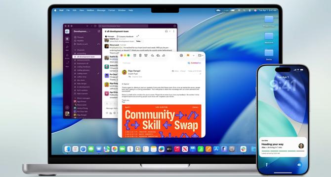
Image Credit: BGR
macOS Tahoe completely ruins the beloved Finder icon
- Apple's WWDC keynote, although lacking groundbreaking features, focuses on improvements for upcoming releases.
- macOS Tahoe and iOS 26 are introduced as compelling upgrades despite not being revolutionary.
- The new macOS Finder icon design change, flipping the color scheme, upsets long-time Mac users.
- The Finder icon design has been consistent for over 25 years, making the unnecessary change off-putting.
- Criticism of the icon change has surfaced on social media, with users questioning the motive behind the design tweak.
- A designer suggests a way Apple could have incorporated the Liquid Glass motif without altering the iconic Finder icon drastically.
- The original Happy Mac icon was designed by Susan Kare, adding a layer of historical significance to the Finder icon.
- Users may eventually adjust to the new design, similar to past Apple changes like the iPhone X notch.
- macOS Tahoe will be the last major update compatible with Intel Macs before transitioning to Apple's M-series chips.
- The post discusses the Finder icon change in macOS Tahoe and its effects on long-time users.
- Despite the Finder icon controversy, macOS Tahoe introduces significant new features for users.
- The Finder icon's design history and legacy add to the disappointment users feel about the unnecessary change.
- There are hopes that Apple might reconsider the Finder icon design in future macOS betas.
- Users are encouraged to explore the new features in macOS Tahoe beyond the controversial Finder icon change.
- Apple's decision to alter the Finder icon color scheme receives mixed reactions, sparking debates among Mac users.
Read Full Article
12 Likes
For uninterrupted reading, download the app