Dev
3w
53

Image Credit: Dev
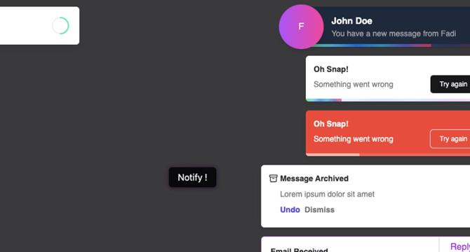
React-toastify v11 - finally easy to customize
- React-toastify has released its latest version, which is equipped with main features on customization.
- With the version, the notification feature will be able to blend into any design system.
- The DOM structure of the notification has been simplified by removing extraneous div elements, nested elements, making it more customizable. It has multiple CSS variables that can be updated as per requirements.
- The latest version comes with a new feature of having a custom progress bar, autoClose, pauseOnHover, pauseOnFocusLoss and a controlled progress bar.
- ToastContainer and toast now accept an aria-label prop for screen readers, and the user can use Tab to navigate through the notification.
- The removal reason is now possible with the new callback: onClose(reason?: boolean | string) => void.
- The hooks useToastContainer and useToast are no longer exposed, neither do onClose and onOpen receive children props.
- React-toastify/dist/ReactToastify.minimal.css is removed, and no longer dependent on Scss. The library uses plain old css.
- The release also brings some bug fixes and improvement in onClose callback speed.
- Developers can refer to the Stackblitz collection of examples. The documentation is also being rewritten to better help them understand and work with the new version.
Read Full Article
3 Likes
For uninterrupted reading, download the app