A naukri.com initiative
Dev
5d
183
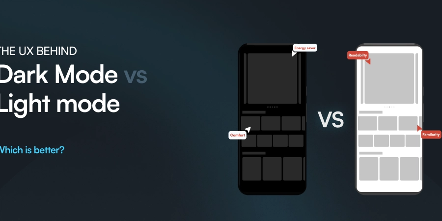
Image Credit: Dev
The UX behind Dark mode vs. Light mode: Which one is Better?
- The choice between light and dark interfaces significantly impacts usability, accessibility, and brand identity in the digital era.
- Understanding the benefits of light mode and dark mode is crucial for designing modern apps and websites.
- The contrast and perceptions play a significant role in the readability of light and dark interfaces based on the environment.
- Advantages of light mode include enhanced readability, familiarity, versatility, and professional appeal, while potential eye strain and increased blue light are disadvantages.
- Dark mode offers advantages like comfort in low-light settings, energy efficiency, modern aesthetics, and distinct brand identity but may face readability issues and design challenges.
- The choice between light and dark interfaces should be based on audience preferences and content context for better user experience.
- Implementation best practices include empowering user choice, focusing on accessibility, thoughtful customization, and collecting feedback for design refinement.
- Real-world inspirations show how industry leaders effectively utilize both light and dark interfaces based on their content focus.
- Choosing between light and dark interfaces requires a balanced approach to meet user needs and create a visually appealing design.
- Ultimately, the decision between light and dark interfaces should be based on audience needs and design trends for a more informed choice.
Read Full Article
11 Likes
For uninterrupted reading, download the app