A naukri.com initiative
Hackernoon
6d
247
Image Credit: Hackernoon
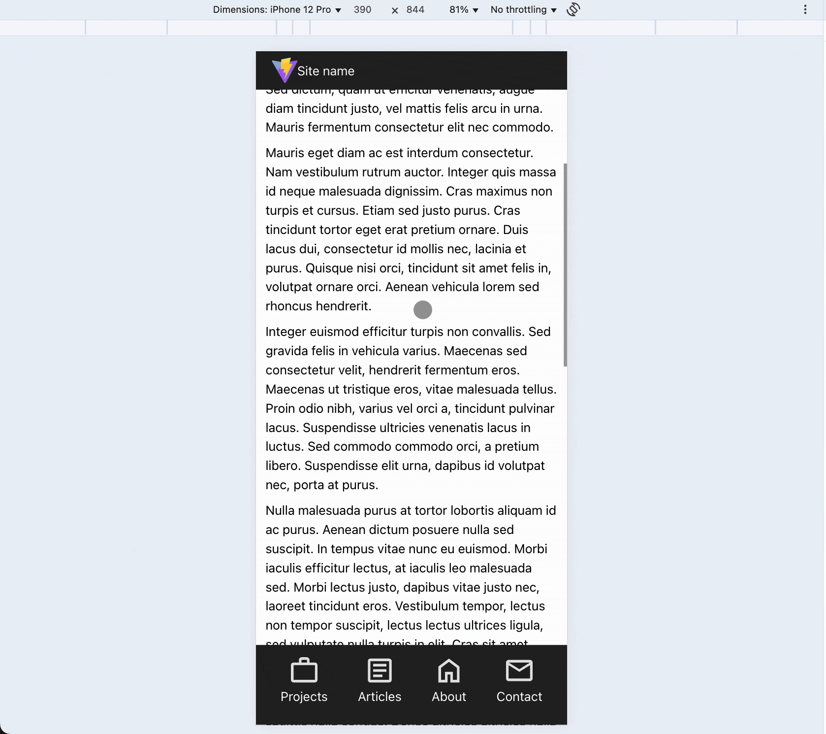
This Scroll-Based Header Will Make Your Website Feel 10x Smoother on Mobile
- This article discusses creating a scroll-based header for mobile websites to save space and enhance user experience.
- The guide covers building this interaction using HTML, CSS, and JavaScript with the help of Vite for local development.
- It provides steps for setting up the project, cleaning up unnecessary files, and downloading icons for the project.
- The mobile layout includes a header with a logo and navigation buttons at the bottom for easier access.
- Desktop layout adjustments involve media queries for proper styling and positioning.
- Additionally, the article explains adding scroll-based header behavior with JavaScript to hide the menu on scroll down and reveal it on scroll up.
- It details the steps, including handling scroll direction, adding CSS transforms, toggling classes, and setting up scroll offsets.
- The article also discusses resolving mobile scrolling issues, disabling scroll behavior on desktop, and cleaning up the code for better maintainability.
- In conclusion, the tutorial provides a fully responsive header solution that works on both mobile and desktop screens, keeping navigation accessible without requiring extra libraries.
- Live demos, CodeSandbox links, and source code on GitHub are provided for reference and implementation.
- For further assistance or inquiries, the article encourages reaching out for support.
Read Full Article
14 Likes
For uninterrupted reading, download the app