A naukri.com initiative
Self-Learning-Java
1M
49
Image Credit: Self-Learning-Java
Understanding the Behavior of CSS Width and Max-Width When Parent Element is Smaller
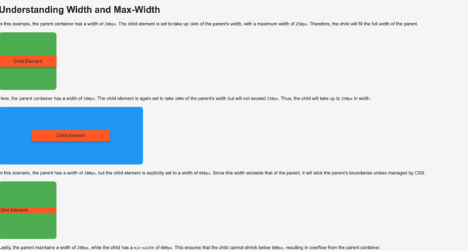
- The width property in CSS defines the exact width an element will take up, regardless of the parent element's size.
- To handle situations where a child element overflows its parent due to fixed width, using percentage-based width like width: 50%; can maintain proportionality.
- The max-width property in CSS sets the maximum width an element can take, making it suitable for responsive designs.
- Using max-width ensures that elements do not exceed certain sizes while adapting to varying screen sizes.
- In examples, setting width: 100%; and max-width: 300px; allows an element to fill the parent's width up to a maximum of 300 pixels.
- Child elements adjust to the parent's width accordingly - shrinking if the parent is smaller than the specified width or capping at the max-width.
- Setting a child element's width beyond the parent's width results in the child element fitting within the parent's dimensions due to CSS overflow handling.
- If a child element has a min-width exceeding its parent's width, it may lead to overflow issues disregarding the parent's width limits.
- CSS layout ensures that child elements do not visually overflow their parent containers but adjust within the constraints set by width and max-width properties.
- Handling child element widths relative to their parents effectively avoids overflow problems and ensures proper layout control.
Read Full Article
3 Likes
For uninterrupted reading, download the app