A naukri.com initiative
Logrocket
1w
59
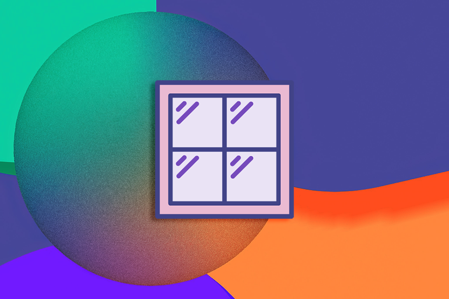
Image Credit: Logrocket
What is glassmorphism? How to create glassmorphic designs
- Glassmorphism is a UI design trend that leverages glass-textured backgrounds to create a modern or futuristic aesthetic, suitable for luxury brands and tech products.
- Pros of glassmorphism include being clean, modern, engaging, easy to design and code, performant, and helpful in establishing visual hierarchy.
- Cons of glassmorphism include potentially making apps or websites look cluttered and posing challenges with color contrasting for optimal accessibility.
- Originating in Windows Vista and refined by Apple in iOS 7, glassmorphism has gained popularity but is often showcased more in designs than in real products.
- Creating glassmorphic designs involves properties like opacity, background color, background blur, border, drop shadow, and gradient to impact user experience.
- Glassmorphism can be practical to implement on the web and in apps, with modern CSS features making it easier than before.
- Best practices for glassmorphism include ensuring accessibility, keeping the effects subtle, and using it thoughtfully for a luxury or tech brand.
- While glassmorphism can be visually appealing and attention-seeking, it should be used sparingly and with consideration for usability and accessibility.
- Microsoft and Apple have showcased the potential of glassmorphism, but its widespread adoption in real products remains limited despite being a popular design trend.
- Despite the initial complexity, modern advancements make implementing glassmorphic effects into production apps and websites easier.
- In conclusion, glassmorphism can be a good UI design trend to follow when used judiciously, balancing visual aesthetics with usability and accessibility considerations.
Read Full Article
3 Likes
For uninterrupted reading, download the app