A naukri.com initiative
UX Design
6d
107
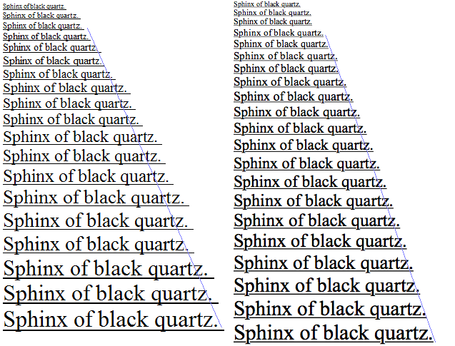
Image Credit: UX Design
Why fonts look better on macOS than on Windows
- Text looks nicer on a Mac than on a Windows PC due to deliberate font rendering choices made by each operating system.
- macOS prioritizes aesthetic fidelity, rendering fonts true to their design for a smoother appearance, while Windows prioritizes on-screen readability and sharpness.
- Apple preserves the shape and weight of the typeface, whereas Microsoft 'hammers' outlines to the pixel grid for crispness, resulting in differences in text thickness and crispness.
- These differences in font rendering philosophy explain why text on a Mac may look thicker or smoother, while text on Windows may appear thinner but crisper.
Read Full Article
6 Likes
For uninterrupted reading, download the app