Dev
19h
181

Image Credit: Dev
Why Holding Buttons Is Superior to Confirmation Dialogs in UX Design
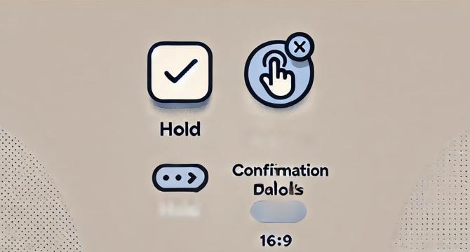
- Hold-to-confirm buttons are a superior alternative to traditional confirmation dialogs.
- Confirmation dialogs are often more annoying than helpful as they interrupt the user's flow.
- Hold-to-confirm buttons require users to hold a button for a time defined to execute an action which improved UX and reduced errors.
- Hold-to-confirm buttons engage a user's cognitive processes better than confirmation dialogs.
- The duration of an action in Hold-to-confirm buttons depends on the nature of the task.
- Visual cues like a progress bar are key to the effectiveness of Hold-to-confirm buttons.
- The duration of an action in Hold-to-confirm buttons depends on the nature of the task.
- Hold-to-confirm buttons maintain efficiency while preventing users from performing unintended actions.
- A simple programming change that is easy to implement is all that is required to enhance the user experience.
- Hold-to-confirm buttons streamline the user experience by reducing accidental actions while enhancing user intentionality.
Read Full Article
10 Likes
For uninterrupted reading, download the app