UX Design
1d
91

Image Credit: UX Design
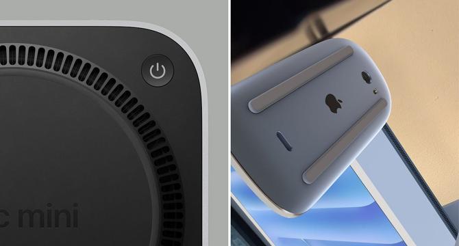
Why is the Mac mini power button on the bottom?
- Apple recently released the M4 Mac Mini with a power button on the bottom, sparking controversy.
- Some consider it a design flaw reminiscent of the Magic Mouse charging port placement.
- The decision has left many questioning the reasoning behind this choice.
- To understand the significance, it's worth examining the power button placement on previous Mac Mini models.
Read Full Article
5 Likes
For uninterrupted reading, download the app