Medium
1w
363

Image Credit: Medium
Why Logos Are Getting Boring
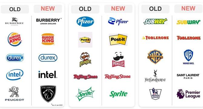
- Logos in the marketing world are increasingly losing their personality and being simplified.
- Visual identity encompasses more than just a logo, including colors, fonts, website designs, and image styles.
- Large corporations have detailed brand manuals dictating how every visual element should be presented.
- There is a trend in logos towards simplification as companies aim for a more streamlined and minimalist look.
- This trend is driven by a desire for uniformity and consistency across various platforms and marketing channels.
- Logos are being stripped down to their essential elements as part of this simplification process.
- The concept of visual identity is often misunderstood by those outside the design field.
- Small businesses might only require a logo and a few brand colors, while larger corporations have more complex visual branding requirements.
- The battle for simplification in logos is a widespread phenomenon across the industry.
- The shift towards minimalism in logo design is driven by the need for a cohesive brand image across different mediums.
- Visual identity plays a crucial role in defining what a company stands for.
- Logos form just one part of a brand's overall visual identity.
- The quality of logos in marketing is perceived to be declining as they become more generic and stripped of individuality.
- There is a push for logos to be more streamlined and simplified across the board.
- The changing landscape of logos reflects a broader trend towards minimalist and clean design aesthetics in branding.
Read Full Article
21 Likes
For uninterrupted reading, download the app