A naukri.com initiative
Nintendolife
7d
12
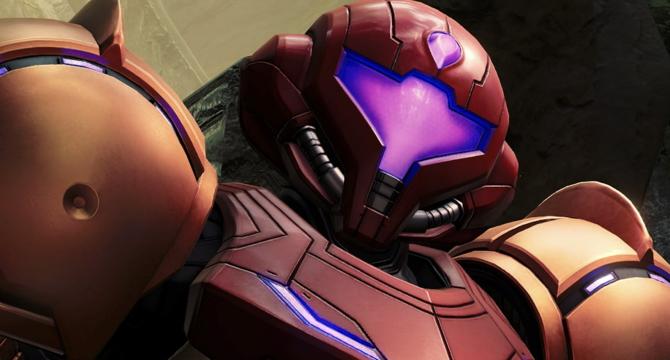
Image Credit: Nintendolife
Yep, Metroid Prime 4's Box Art For Switch 2 Is... Corrupted
- Nintendo has revealed the box art for the 'Nintendo Switch 2 Edition' of Metroid Prime 4, which has received criticism for its design.
- The box art for the Switch 2 version includes a large red bar at the top distinguishing it from the original Switch version.
- The Switch 2 box art features a text dump at the bottom, explaining the inclusion of the original Switch version and Switch 2 upgrade pack.
- Critics find the excessive text on the box art to be distracting and unnecessary, impacting the visual appeal compared to the original version.
- Despite the box art criticisms, the game itself is praised for its stunning visuals and support for 4K/60FPS gameplay via Quality Mode and 1080p/120FPS.
- The decision to include detailed information on the front of the box has sparked discussions among gamers about the importance of box art aesthetics.
- Some speculate that the physical version of the game may only contain the original Switch version, with the Switch 2 upgrade likely provided as a download code.
- Concerns are raised about the potential impact on cartridge speeds and gameplay experience, especially for those opting for the physical Switch 1 version and the upgrade pack.
- Critics express disappointment over the box art choices for Switch 2 games, citing a preference for more visually appealing and collector-friendly designs.
- Nintendo's strategy with physical versions prompts discussions on the shift towards digital purchases and the implications for future game collections.
- The debate surrounding the Metroid Prime 4 box art highlights differing opinions on the balance between providing clear information to buyers and maintaining aesthetic appeal.
Read Full Article
Like
For uninterrupted reading, download the app