A naukri.com initiative
Medium
1M
162
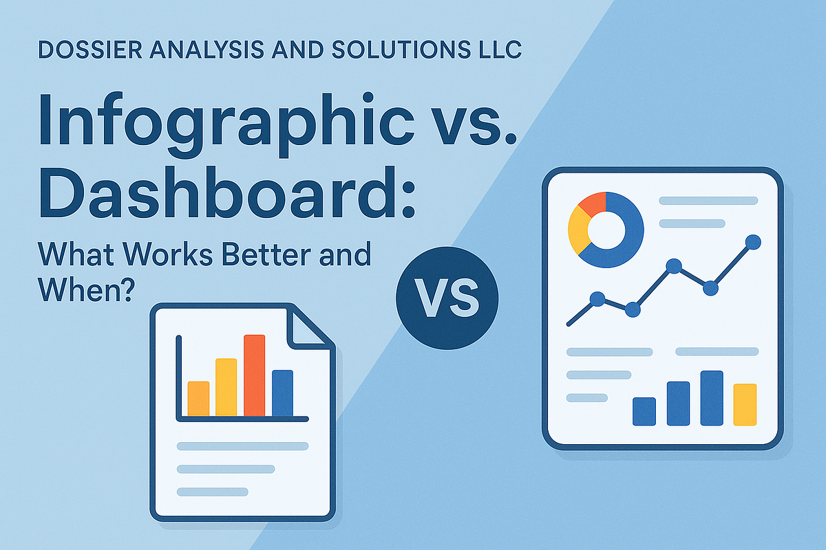
Image Credit: Medium
Infographic vs. Dashboard: What Works Better and When?
- Infographics and dashboards serve different purposes - infographics for one-time communication and dashboards for ongoing interaction.
- Infographics are static, elegant, and consumable at a glance, while dashboards are dynamic, interactive, and used for real-time decision-making.
- Knowing when to use each tool and designing them effectively, especially in tools like Power BI, is crucial for conveying messages and insights effectively.
- This article discusses when to choose an infographic vs. a dashboard, how to incorporate them into business intelligence workflows, and the benefits of combining both for maximum impact.
Read Full Article
9 Likes
For uninterrupted reading, download the app