A naukri.com initiative
Tech Radar
2d
417
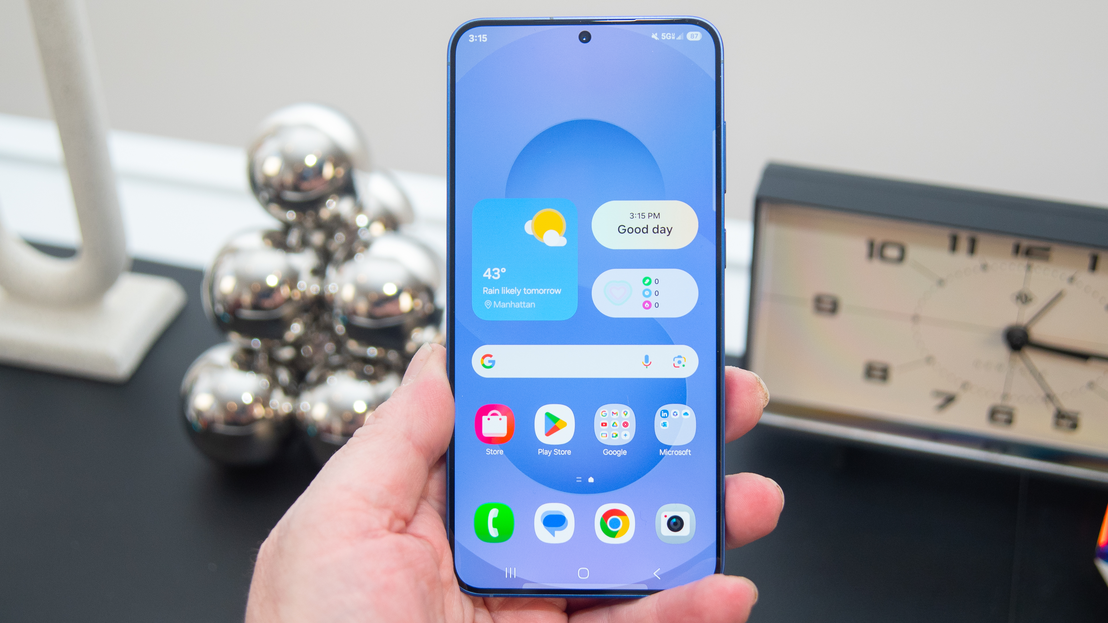
Image Credit: Tech Radar
Samsung’s terrible new battery icon proves Apple made the right call with Liquid Glass
- Samsung introduced its latest mobile operating system update, One UI 7, with visual refresh including new icons and color schemes.
- One notable change in One UI 7 is the new battery icon, criticized for being confusing and hard to recognize.
- The battery icon appears as a round oval and can include a percentage in the middle, lacking the clear battery shape from the previous version, One UI 6.
- The difficult-to-understand battery icon has led to confusion among users when trying to identify the battery status on Samsung phones running One UI 7.
- Comparatively, Apple's Liquid Glass design with iOS 26, iPadOS 26, and macOS 26 prioritizes realistic and familiar icons over abstract representations.
- Apple's approach to maintain pictographic battery icons contrasts with Samsung's more abstract design choice in One UI 7.
- The discussion on UI design complexity and user-friendliness is sparked by Samsung's new battery icon, highlighting the importance of catering to everyday users.
- While Samsung's One UI 7 received praise for its charming and colorful presentation on Samsung phones, the battery icon design has faced criticism for clarity issues.
Read Full Article
13 Likes
For uninterrupted reading, download the app