A naukri.com initiative
Web Design
Logrocket
64
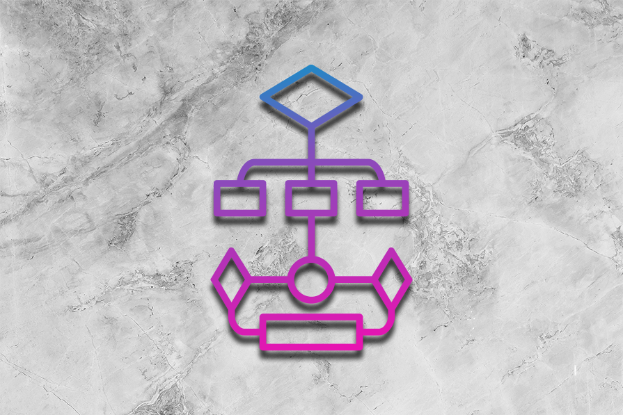
Image Credit: Logrocket
Understanding the dependency inversion principle (DIP)
- The dependency inversion principle (DIP) ensures that high-level modules do not depend on low-level modules directly, promoting loose coupling for easier maintenance.
- High-level modules provide abstractions over system functionalities and should communicate through interfaces with low-level modules in DIP.
- Abstractions play a crucial role in DIP by decoupling high-level and low-level modules, enhancing flexibility and testability of the codebase.
- Dependency inversion aims to decouple concrete classes using abstractions, interfaces, or abstract classes, leading to easier testing and modular code design.
- DIP promotes loose coupling, code maintainability, testability, scalability, and code reusability in various software development scenarios.
- Implementing DIP in multiple languages like Python, Java, TypeScript, Spring (Java with IoC), .NET Core (C#), and ASP.NET Core demonstrates how to apply the principle effectively.
- Practical use cases of DIP include microservices architectures, event-driven architectures, enterprise software, payment processing systems, notification services, and database access layers.
- Common pitfalls of DIP like over-abstraction, interface bloat, and misusing dependency injection can be avoided by following best practices and using DIP only when necessary.
- Developers should use DIP when implementations are likely to change often or when interchangeable implementations are required, while direct dependencies are suitable for minimal service variations.
- Applying SOLID principles together with DIP, choosing the right level of abstraction, and structuring DIP-compliant code properly are recommended best practices.
- In conclusion, mastering the dependency inversion principle empowers developers to create flexible, scalable, and maintainable software by leveraging abstractions to separate business logic from implementation details.
Read Full Article
3 Likes
Medium
183

Image Credit: Medium
Lock-In a 60% Discount With Our EXCLUSIVE Bundle Package That is NOT Available ANYWHERE Else.
- Introducing our EXCLUSIVE Bundle Package, a limited-time offer with a 60% discount, not available anywhere else.
- The bundle has been curated to offer maximum value and includes premium products and services.
- The deal is a limited-time offer, and once it's gone, it won't be available again.
- To claim the discount, visit the website and secure the bundle before it's too late.
Read Full Article
11 Likes
Design-Milk
41

Image Credit: Design-Milk
The Nomad Tracking Card Is an AirTag Alternative for Your Wallet
- The Nomad Tracking Card is a credit card-sized tracker that works with the Apple Find My app.
- It has a thickness of around two standard credit cards, making it suitable for most wallets.
- The battery life lasts for five months on a single charge and can be recharged by placing it on a Qi or MagSafe charger.
- The Tracking Card works with the Apple Find My network, allowing you to track its location using the app on your iPhone.
Read Full Article
2 Likes
Design-Milk
22

Image Credit: Design-Milk
Nature, Art, and Architecture Converge at The Loren Hotel Austin
- The Loren Hotel Austin represents a new paradigm in hotel design, focusing on the quality of experience and environmental responsibility.
- The hotel's design philosophy combines natural materials, contemporary furnishings, and thoughtful lighting design.
- The rooftop restaurant Nido features an infinity pool that seamlessly merges with Lady Bird Lake and a 'vertical garden' of lush greenery.
- Art curator Penny Aaron's elegant curation adds to the hotel's ambiance, with works by Liam Gillick and Olafur Eliasson.
Read Full Article
1 Like
Discover more
- Programming News
- Software News
- Devops News
- Open Source News
- Databases
- Cloud News
- Product Management News
- Operating Systems News
- Agile Methodology News
- Computer Engineering
- Startup News
- Cryptocurrency News
- Technology News
- Blockchain News
- Data Science News
- AR News
- Apple News
- Cyber Security News
- Leadership News
- Gaming News
- Automobiles News
Dev
252
Image Credit: Dev
The Future of UI Components: Trends & Innovations in 2025
- In 2025, the landscape of UI components is evolving to meet the demands of robust, scalable, and flexible solutions in modern application development.
- Key trends include the rise of low-code/no-code platforms, AI-driven UI components, and seamless cross-framework compatibility.
- ReExt bridges Ext JS and React, allowing for efficient integration of powerful UI components into applications.
- AI is enhancing accessibility, automating UI adjustments, and boosting personalization in user interfaces.
- Micro frontends and modular UI components enable independent development, scalability, and faster updates in application design.
- Performance optimization focuses on lazy loading, server-side rendering, and lightweight components for enhanced speed and efficiency.
- Accessibility-first approaches, customizable UI components, and enhanced data visualization are shaping the future of user interfaces.
- Cloud-based UI component libraries offer on-demand access, reduced dependencies, and streamlined version management.
- ReExt supports theme-based customization, dynamic styling, and interactive data visualization for enriched user experiences.
- The future of UI components in 2025 promises unprecedented efficiency, intelligence, and flexibility, driven by innovative AI enhancements and cross-framework compatibility.
Read Full Article
15 Likes
UX Design
325

Image Credit: UX Design
Watch out: Gemini is coming for your Google Workspace
- Gemini is an AI-powered work tool that aims to compete with Google Workspace.
- Gemini provides features to help users save time and improve their writing.
- The tool offers assistance in composing emails and refining existing messages.
- Gemini is positioned as a competitor in the race for AI-powered work tools.
Read Full Article
19 Likes
UX Design
45
Image Credit: UX Design
AI is reshaping UI — have you noticed the biggest change yet?
- AI is driving a new UI paradigm, shifting interactions from rigid processes to intuitive workflows where users define intentions while AI determines the best path forward.
- This shift challenges traditional assumptions about control and agency in human-machine collaboration, akin to the transition from command-line interfaces to graphical user interfaces.
- Direct manipulation interfaces, defined by immediate, visible actions on screen, have been foundational in UI design; however, AI-driven systems introduce goal-oriented interactions.
- AI interactions involve fluid, iterative processes where users collaborate with the system, refining inputs to achieve desired outcomes, marking a significant evolution in UI design.
- While direct manipulation remains relevant, AI enhances interactions by layering new models on established patterns to make interactions smoother and more intuitive.
- AI experiences should build on familiar patterns, such as utilizing open-ended prompts to guide user intent in a flexible and approachable manner.
- UX frameworks are also evolving to integrate AI, such as incorporating prompt writing and AI content generation early in the workflow to enhance content fidelity and user testing.
- The goal of AI in interface design is to seamlessly integrate into the user journey, empowering users by reducing friction and complexity, ultimately becoming an invisible assistant in achieving user goals.
- Effective AI should refine itself around user needs, like Netflix's recommender system, which quietly learns and adapts to provide effortless suggestions without demanding user attention.
- Designers should aim for AI that blends into the user experience, empowering users and minimizing unnecessary choices, ultimately enhancing the flow of achieving user objectives.
Read Full Article
2 Likes
UX Design
13

Image Credit: UX Design
The effort paradox in AI design
- The effort paradox in AI design explores how making tasks too easy through automation can lead to negative outcomes, drawing parallels to historical product design mistakes.
- Lessons from Betty Crocker and IKEA demonstrate that adding a bit of effort, like requiring an egg in a cake mix, can increase user satisfaction and engagement.
- Studies show that consumers value products they assemble themselves more than preconstructed versions, highlighting the importance of human involvement in product interaction.
- While minimizing effort in design can work, removing too much effort in AI product interactions can diminish psychological ownership and satisfaction.
- Balancing automation with human involvement is crucial to creating AI products that enhance user experience and foster a sense of accomplishment and control.
- Guidelines for AI product designers include finding optimal human touchpoints, preserving human agency, showing transparent AI processes, enabling learning, and allowing customization.
- Effort isn't the enemy in design, and designers should avoid over-automation to respect human agency and amplify human potential.
- As AI capabilities evolve, designers must navigate the temptation to over-automate and focus on nuanced design that respects human effort and agency.
- The article encourages designers to consider the balance between manual and automated processes and emphasizes the importance of human engagement in AI design.
- It concludes by urging designers to steer past the tendency to over-automate and instead focus on designing AI products that empower users while respecting their effort and potential.
Read Full Article
Like
Alvinashcraft
69

Image Credit: Alvinashcraft
Dew Drop – February 20, 2025 (#4366)
- Microsoft announced the Chroma DB C# SDK and Majorana 1 quantum processor.
- .NET Rocks! featured Uno Hot Design and GitHub Copilot enhancements.
- Updates in Deno 2.2, AWS Documentation, and Rust Beta SDK for Azure were highlighted.
- New MAUI Bullet Chart for product sales data tracking was introduced.
- MSVC C++ Code Analysis updates and AutoMapper 14.0 release were discussed.
- Arm Extension for GitHub Copilot and Azure AI Foundry Labs were unveiled.
- The article covers various topics like adaptive vs. responsive design and AI agent building.
- Xcode IDE update, TypeScript enums in React Native guide, and Flutter Navigation topic were featured.
- Screencasts on WinForms projects and Majorana 1 explanation were showcased.
- Podcasts on tech topics like Nuxt, quantum computing, and Scrum strategies were shared.
Read Full Article
4 Likes
Designboom
435

Image Credit: Designboom
BIG unveils jinji lake pavilion with pixelated glass roof on suzhou’s waterfront
- BIG – Bjarke Ingels Group completes the Jinji Lake Pavilion, their first project in Suzhou, China.
- The 1,200-square-meter pavilion draws inspiration from traditional Chinese courtyard typology and features a pixelated glass roof.
- The project is part of Suzhou's initiative to activate the lakeside promenade, with various public rooms arranged under a single unifying canopy.
- Transparent glass facades, double-height entrances, and a two-layered shading system add to the pavilion's design and functionality.
Read Full Article
26 Likes
Designboom
298

Image Credit: Designboom
mirroring steel shards by gregory orekhov float across central park’s water surface
- Steel Shards is a large-scale installation by artist Gregory Orekhov
- The project consists of composite panels with mirror-polished stainless steel surfaces arranged on a water surface in Central Park
- The fragmented reflections on the polished steel create a shifting visual experience, emphasizing both instability and cohesion
- The installation aims to explore themes of rupture, restoration, and integration
Read Full Article
17 Likes
Designboom
18

Image Credit: Designboom
UNA barbara valentim wraps japi house with curved rammed earth walls in são paulo
- UNA Barbara Valentim completes rammed earth home in Brazil.
- Japi House, located in São Paulo countryside, reinterprets ancient construction techniques.
- The house features curved rammed earth walls, exposed concrete, and a rooftop garden.
- Bioclimatic strategies, such as an internal courtyard and deep overhangs, enhance energy efficiency.
Read Full Article
1 Like
Designboom
430

Image Credit: Designboom
alef aeronautics’ drivable flying car takes flight for the first time
- Alef Aeronautics’ drivable flying car takes its maiden flight in a city field.
- CEO explains the reason for not showing the video earlier and emphasizes on safety.
- Key features of the Alef Model A include vertical take-off, no exposed propellers, and obstacle detection system.
- Alef Aeronautics plans to introduce a four-person drivable flying sedan in 2035 with autonomous flight capabilities.
Read Full Article
25 Likes
Architecturesideas
96

Image Credit: Architecturesideas
The Importance of Choosing the Right Plumber: A Homeowner’s Guide
- Choosing the right plumber is crucial for homeowners to avoid costly repairs and ongoing issues.
- Price should not be the sole deciding factor, as quality plumbing work requires investment in materials, expertise, and time.
- Proper credentials, insurance coverage, and professionalism are important factors to consider when hiring a plumber.
- Choosing a local plumber with knowledge of the area can offer advantages in problem diagnosis and response times.
Read Full Article
5 Likes
Medium
91

Image Credit: Medium
Unlock the Power of Visuals: Tips for Creating Infographics That Pop!
- Understanding your audience is crucial for creating effective infographics.
- Keep your design simple and focus on the core message.
- Use contrasting colors and bold typography to make your design visually striking.
- Include icons and images that relate to the content to make the infographic more approachable.
Read Full Article
5 Likes
For uninterrupted reading, download the app