Web Design
Gritdaily
362

Image Credit: Gritdaily
Wealth Protocol: Where Bitcoin Meets Black Luxury
- LaQuida Landford founded AfroVillage PDX in Portland, focusing on community wellness and addressing racial disparities.
- AfroVillage led an initiative to provide wifi access to underserved communities and transform public transportation trains into a hub for the Black community.
- LaQuida launched Wealth Protocol, a fashion line blending luxury fashion with blockchain technology, featuring Bitcoin-inspired garments.
- Wealth Protocol's collection, displayed at MACQ in Cancun, aims to redefine luxury as a tool for empowerment and financial sovereignty for people of color.
Read Full Article
21 Likes
Design-Milk
265
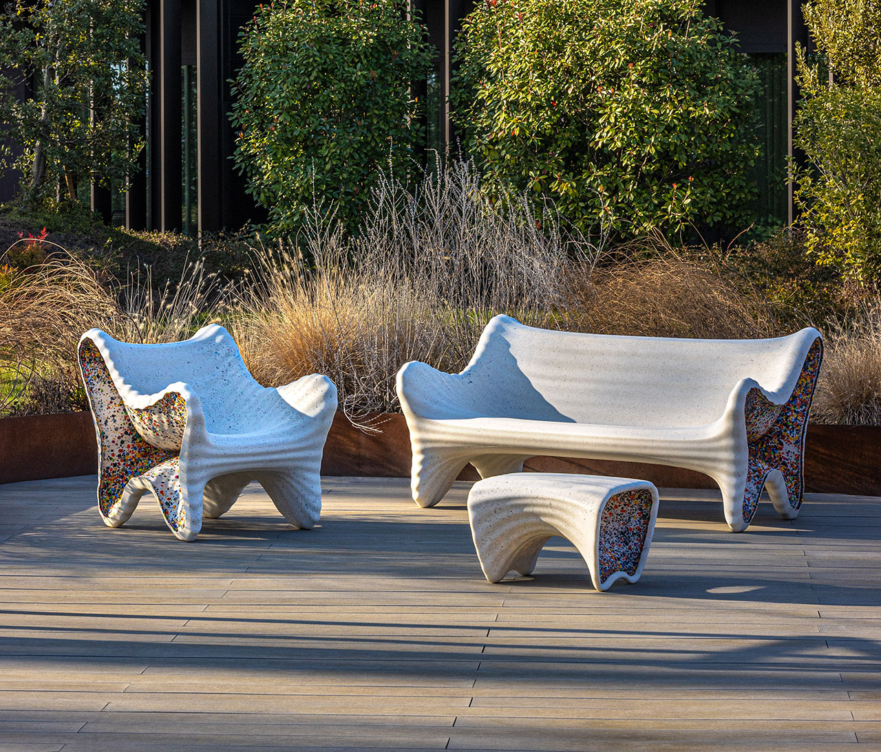
Image Credit: Design-Milk
The In-Side Collection Offers a Pop of Color All Year Round
- The In-Side Collection by Thomas Heatherwick for Magis features outdoor furniture with a unique shell-like design and colorful spots made of recycled plastic.
- The collection showcases innovative rotational molding techniques using recycled polyethylene to create surprising color patterns on the furniture's interior.
- Thomas Heatherwick's design style focuses on rigorous research into materiality and production methods, emphasizing sustainability and imaginative design.
- Magis, known for pushing design boundaries, incorporates values of respect and loyalty into their work, emphasizing craftsmanship and Italian artisanal tradition.
Read Full Article
15 Likes
Medium
285
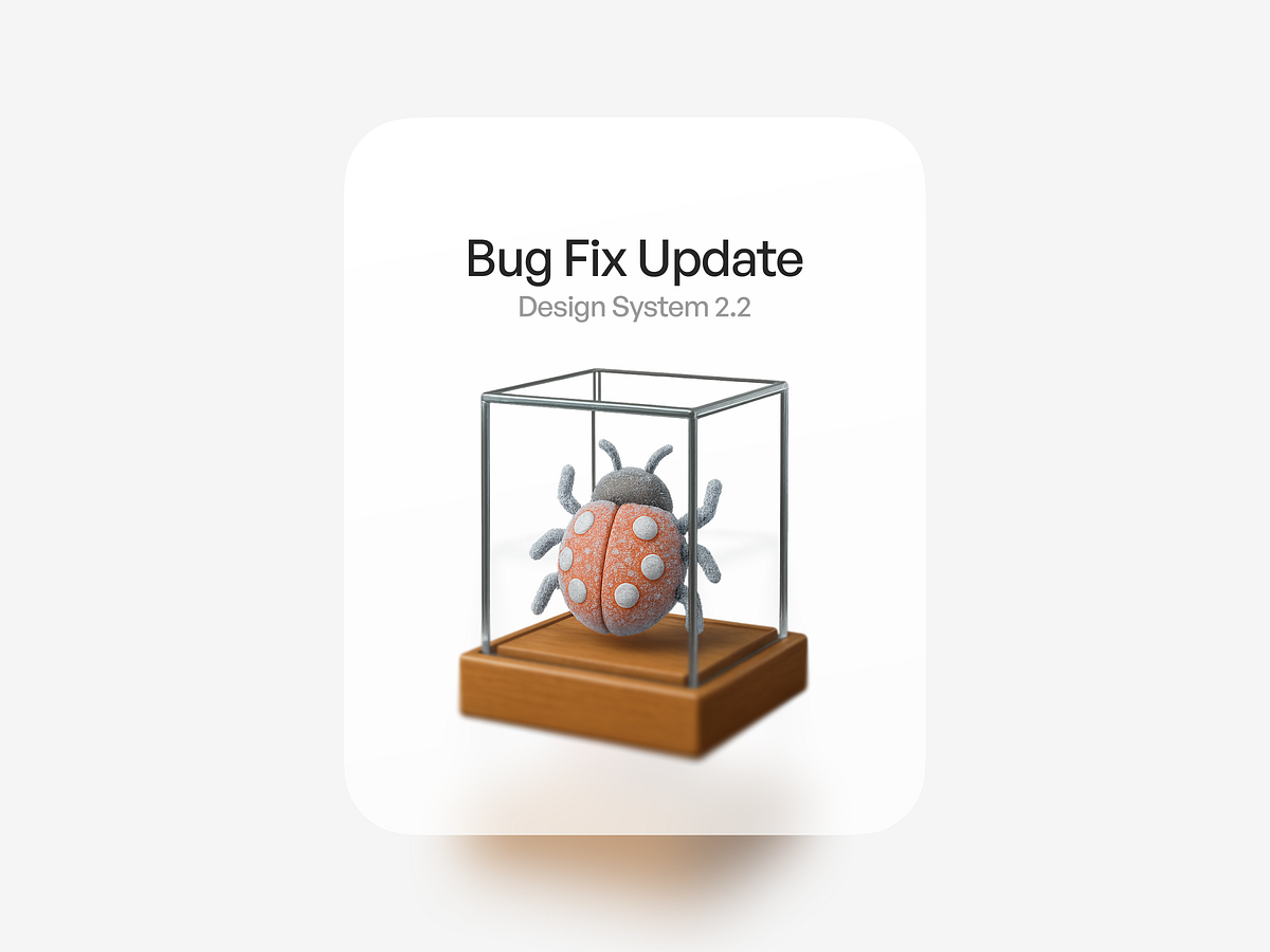
Image Credit: Medium
Case Study: Product Development & The Museum of Bugs
- A new update was released with some improvements and some broken features.
- Instead of just fixing the broken features, the team highlighted the beauty in the imperfections.
- They created 'The Museum of Bugs' to showcase the failures and struggles they faced during product development.
- The museum served as a reminder of the challenges overcome and made the team and users appreciate the journey.
Read Full Article
17 Likes
Dev
8

Image Credit: Dev
What Don’t Make Me Think Taught Me About Intuitive Design
- Good interfaces don’t make users think; they guide users seamlessly.
- Users scan, not read; use clear headings and visual cues.
- Design for satisficing; make the right options obvious and easy to find.
- Utilize design conventions, aim for clear navigation, and test usability early.
Read Full Article
Like
Discover more
- Programming News
- Software News
- Devops News
- Open Source News
- Databases
- Cloud News
- Product Management News
- Operating Systems News
- Agile Methodology News
- Computer Engineering
- Startup News
- Cryptocurrency News
- Technology News
- Blockchain News
- Data Science News
- AR News
- Apple News
- Cyber Security News
- Leadership News
- Gaming News
- Automobiles News
Design-Milk
265

Image Credit: Design-Milk
F5: ThinkLab’s Amanda Schneider on Her Favorite Statistics for Designers
- Amanda Schneider, with an industrial design background, emphasizes the intersection of creativity and strategy to drive industry change and humanize data through SANDOW DESIGN GROUP's ThinkLab.
- She leads market research within the design and architecture ecosystem, translating insights into actionable stories and hosting the podcast Design Nerds Anonymous.
- Statistical insights shared by Schneider include the significant influence of designers on purchasing decisions and the industry's impact on carbon emissions and workforce demographics.
- Designers influence purchasing decisions 40 times more than the average American consumer, with potential ripple effects across industries and sustainability practices.
- By 2050, the interior design industry is projected to influence 10% of the world's carbon emissions, highlighting the importance of sustainable design decisions.
- Gen Z's growing presence in the workforce and the interior design industry emphasizes the need for designers to cater to future end users' evolving values and preferences.
- Despite the interior design industry being predominantly female, only 40% of leadership roles are held by women, indicating a disparity that needs addressing for industry progress.
- Design committee sizes have doubled over the past 5 years, underscoring the importance of effective communication and translation skills for designers to navigate increased complexity and stakeholder involvement.
Read Full Article
15 Likes
UX Design
208
Image Credit: UX Design
Embracing change in UX by adopting a Systems Thinking mindset
- Adopting a systems thinking mindset could help designers better embrace the change happening in the UX design profession.
- There is discourse regarding inevitable change faced by designers due to evolving AI, organizational politics, and focus on product engagement.
- Navigating uncertainty in the design field can be aided by embracing systems thinking according to Sheryl Cababa's book 'Closing the Loop: Systems Thinking for Designers.'
- The article discusses the relevance of systems thinking in design and its potential impact on the future of UX professionals.
Read Full Article
12 Likes
Designboom
253

Image Credit: Designboom
ateno’s clay-coated house overlooks mountains and the sea on a greek island
- Ateno Architecture Studio's Gaia residence in Greece embraces simplicity and uses raw materials to create a luxurious yet intimate ambiance.
- The house's terracotta tones blend with the landscape, giving a feeling of being cradled within the earth and carved from the land itself.
- Gaia features minimalist geometries and rustic textures like terrazzo, marble, and wood, creating an ideal summer residence integrated with nature.
- The design includes five bedrooms, expansive seating and dining areas, a swimming pool, and panoramic views of the Ionian sea and Pindos mountain range.
Read Full Article
15 Likes
Designboom
192

Image Credit: Designboom
air taxis to fly and transport visitors during LA 2028 olympic and paralympic games
- Archer Aviation is set to fly its air taxis during the LA 2028 Olympic and Paralympic Games, serving as the official air taxi provider for the event.
- Archer's electric aircraft, Midnight, will transport VIPs, fans, and event staff around key locations during the Games, using vertiports for takeoff and landing.
- The Midnight air taxis are designed with pilots, can carry four passengers, and have backup systems in place to meet safety standards similar to commercial airplanes.
- Along with supporting emergency and security teams, the partnership between Archer and LA28 aims to revolutionize Los Angeles travel during and after the 2028 Games.
Read Full Article
11 Likes
Designboom
371

Image Credit: Designboom
roc h biel turns beech dust into chairs and modular desks inspired by corinthian columns
- Roc H Biel's Dust Order furniture collection reimagines the elegance of Corinthian columns using upcycled beech wood dust and 3D-printed composites.
- The collection includes a sculptural chair and modular desk system that explore material contradiction, architectural rhythm, and surreal aesthetics.
- Each object in the collection tells a story of perception, contradiction, and new material possibilities, creating a poetic reflection on legacy and adaptability.
- The project was presented at Salone Satellite 2025 during Milan Design Week, showcasing a blend of classical motifs reshaped through a modern lens.
Read Full Article
22 Likes
Designboom
122
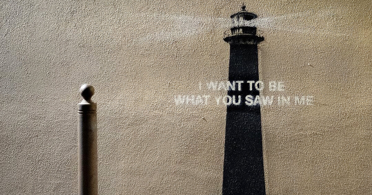
Image Credit: Designboom
banksy returns with a sentimental lighthouse mural in an ‘unknown’ location
- Banksy broke his silence by posting a sentimental lighthouse mural on his Instagram on May 20th, 2025.
- The mural depicts a street bollard in an 'unknown' location transforming into a towering lighthouse with the words 'I want to be what you saw in me' inscribed on it.
- Speculations suggest the location of the mural might be in Marseille, with users on Instagram interpreting the artwork and its message.
- This lighthouse mural signifies Banksy's return to the art scene after his last known mural in December 2024, portraying a Nursing Madonna, and a mural at the London Zoo addressing wildlife captivity.
Read Full Article
7 Likes
Designboom
85
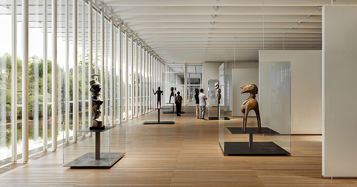
Image Credit: Designboom
renzo piano to design forthcoming KYKLOS arts and culture center in piraeus, greece
- Renzo Piano returns to Greece with the cultural center KYKLOS in Piraeus, commissioned by the Dinos and Lia Martinos Foundation.
- KYKLOS will focus on sustainability, accessibility, and intercultural dialogue to blend contemporary creativity with traditional heritage.
- The center aims to house art collections from Africa, Oceania, and other regions, paired with contemporary exhibitions and educational programs.
- Renzo Piano's architectural vision for KYKLOS emphasizes openness, environmental responsibility, and a strong connection to the local context, with completion expected in late 2028.
Read Full Article
5 Likes
Designbeep
175
Image Credit: Designbeep
20 Best Catalog Templates That Convert Visitors into Customers ( PSD, InDesign, Word, AI )
- Catalog templates are crucial for product presentation and can impact customers' purchasing decisions in a competitive market.
- A great catalog template combines visual appeal, functionality, clean layouts, high-quality images, and easy navigation.
- It is essential for a catalog template to align with brand identity, showcasing products effectively to build brand recognition.
- Understanding customer needs and preferences is key to the success of a catalog template, which should evolve with the business.
- Various catalog templates like A4 Catalogue, Product Catalog, Minimalist Product Catalog, and Interior Catalogs offer diverse styles and purposes.
- Templates like Food Catalogue, Suits Catalog, and Jewelry Catalog Brochure cater to specific industries with tailored designs.
- Square Product Catalog and Square Catalogue Portfolio Template offer unique layouts for modern brands looking to make a bold impression.
- Regular updates and refinements are essential for catalog templates to maintain effectiveness as sales and marketing tools.
- Catalog Brochure Templates like Interior Brochures/Catalogs and Portfolio Brochure Catalog blend storytelling with design for professionals and creatives.
- The versatility and adaptability of catalog templates make them essential for businesses of all sizes, aiming to convert visitors into customers.
Read Full Article
10 Likes
Designboom
335
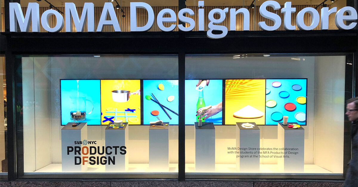
Image Credit: Designboom
looking back at highlights from SVA product design master’s program in new york
- The School of Visual Arts (SVA) in New York celebrates twelve years since the launch of its MFA in Products of Design program.
- The program focuses on five key domains: physical products, digital platforms, social innovation, service & experience design, and commercial ventures.
- Graduates have achieved success with projects that won international awards and were sold through prestigious institutions like the Museum of Modern Art (MoMA).
- The curriculum combines hands-on prototyping with critical studies, encouraging students to design with purpose and impact.
- The program fosters creative inquiry through a no-grade policy and unique features like DESIGN:MATCH, a reverse job fair.
- Graduate projects have addressed critical issues ranging from technology to cultural preservation, showcasing innovation and impact.
- An example is Natya.AI, a dance training tool by Yukti Arora, designed to support Bharatanatyam practitioners through technology.
- 'When No One Believes You' by Antya Waegemann focuses on redesigning rape kits and sexual assault response materials to promote reporting and reduce stigma.
- The program's public exhibitions explore digital ethics, gender identity, and post-pandemic social behavior.
- Students describe the program as transformative, shaping their confidence, creativity, and approach to design challenges.
Read Full Article
20 Likes
Designbeep
155
Image Credit: Designbeep
20 Best Procreate Graffiti Brushes for Authentic Urban Art
- Procreate graffiti brushes offer a digital approach to authentic street art, capturing the raw energy and textures of spray paint on an iPad screen.
- These specialized brushes simulate the unpredictable nature of aerosol paint, providing unlimited do-overs and the freedom to experiment with various techniques.
- Starting a collection of Procreate graffiti brushes can be cost-effective, with many high-quality options available from talented artists, catering to different artistic styles.
- A variety of Procreate graffiti brushes are highlighted, each serving a specific purpose such as creating dirty textures, bold graffiti lettering, 3D effects, neon designs, and more.
Read Full Article
9 Likes
Designboom
249
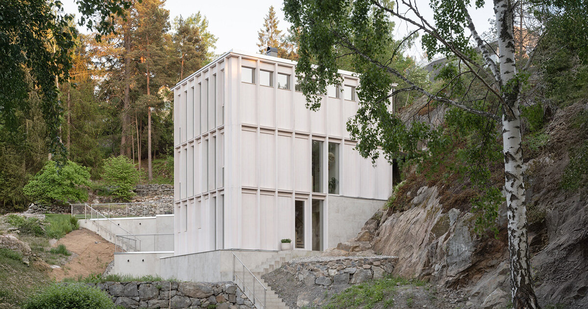
Image Credit: Designboom
kolman boye architects tucks minimalist ‘ravine house’ into steep swedish landscape
- Kolman Boye Architects completed the Ravine House, nestled in a steep gully in Sweden, between two rock faces with limited road access.
- The house, built across three levels, maintains a discreet profile by embedding the lower story into the hillside, meeting height and zoning regulations while preserving the site's topography.
- The design features material experimentation using refined knotty pine for exposed areas, balancing economy and craftsmanship to soften the home's rectilinear form.
- The Ravine House includes terraced stone walls and a granite pond from a previous structure, with each level opening to a different area of the terraced garden, enhancing the connection between interior and exterior.
Read Full Article
15 Likes
For uninterrupted reading, download the app