A naukri.com initiative
Data Analytics News
TechBullion
381

Image Credit: TechBullion
Driving Digital Transformation through Advanced Data-Driven Decision-Making in Utilities
- The utilities sector is undergoing a significant transformation driven by environmental concerns, technological advancements, and changing customer expectations, necessitating a complete digital overhaul.
- Data analytics solutions play a vital role in helping utility companies make informed decisions to enhance customer experience, optimize operations, and create innovative business models.
- Customer expectations in the utilities sector have evolved to demand responsive, personalized services that align with their lifestyles, making digital transformation imperative.
- Data insights are crucial for transforming the utility sector by allowing companies to make informed decisions based on customer, workforce, and grid data, leading to improved efficiency and customer satisfaction.
- Five key ways to achieve digital transformation in the utilities sector include asset management, workforce optimization, customer insights, supply-demand balance, and exploring new revenue streams.
- Predictive maintenance using IoT-enabled sensors and SCADA systems can help utilities prevent unnecessary costs, unexpected failures, and service disruptions by providing real-time data on asset health.
- Digital workforce management tools enable utilities to optimize scheduling, track field personnel, and enhance collaboration between teams for more efficient operations and troubleshooting.
- Data-driven customer insights allow utilities to provide personalized services, build trust, strengthen relationships, and empower customers to control their energy or water consumption.
- Business data analytics help utilities anticipate usage patterns, allocate resources effectively, and balance supply and demand while maintaining grid stability in the evolving energy landscape.
- By embracing digital transformation with data-driven decision-making, utilities can modernize operations, engage customers, drive sustainable growth, and explore new revenue streams for a reliable and innovative future.
Read Full Article
22 Likes
Cloudblog
345
Image Credit: Cloudblog
Accelerate your data-to-insights journey with enhanced BigQuery data canvas
- BigQuery data canvas is a visual workspace aimed at simplifying data analysis and enabling users to harness the potential of their BigQuery data.
- At Google Cloud Next 25, a built-in AI-assistive chat experience in data canvas, powered by Gemini, was introduced to streamline data analysis processes.
- Gemini powers the AI data agent in data canvas, allowing users to generate queries, ask questions, and receive intelligent suggestions using natural language.
- Data canvas revolutionizes how data practitioners interact with data by integrating visual workflows with BigQuery and Gemini.
- The visual query building in data canvas uses a DAG approach, offering flexibility to explore various paths and analyze data across multiple tables efficiently.
- Interactive visualizations in data canvas enable users to uncover insights in real-time through customizable charts, graphs, and tables.
- Applications of AI assistive capabilities in BigQuery data canvas include speeding up telecom support, boosting e-commerce analytics, and streamlining supply chain optimization.
- Data canvas empowers users to make data-driven decisions across various industries by analyzing and visualizing data effectively.
- By combining visual workflows, BigQuery capabilities, and Gemini intelligence, data canvas aims to make data exploration accessible and actionable for all users.
- Experience the future of data exploration by leveraging the capabilities of BigQuery data canvas, which provides a seamless blend of natural language processing and graphical workflows.
Read Full Article
20 Likes
Cloudblog
436

Image Credit: Cloudblog
How Mars Wrigley uses agile media experiments to measure sales lift with EPAM and Cortex Framework
- Mars Wrigley is using EPAM and Cortex Framework to measure sales lift and audience effectiveness of in-flight campaigns.
- Mars Wrigley is integrating its own data using Cortex Framework to connect media data with sales information, creating a unified view of ad impact.
- By combining data in BigQuery and using BQML, Mars Wrigley can better understand how specific audience targeting strategies drive incremental sales lift.
- Cortex Framework provides instant insights, customizable analytics, and seamless integration with major media platforms.
Read Full Article
26 Likes
Pymnts
145

Image Credit: Pymnts
Nasdaq and AWS Partner to Take Global Capital Markets to the Cloud
- Nasdaq and Amazon Web Services (AWS) have partnered to modernize the infrastructure of capital markets and transition to cloud-based systems.
- The collaboration aims to promote global market interconnectivity, improve liquidity, and support innovation while ensuring compliance with local regulations.
- Nasdaq Eqlipse, a cloud-ready platform with next-generation marketplace technology solutions, is a key component of the collaboration, offering standard APIs and data intelligence tools.
- The partnership will assist Nordic markets, the Johannesburg Stock Exchange, and Grupo BMV in their efforts to reduce operational burdens and adopt emerging technologies.
Read Full Article
8 Likes
Pymnts
418

Image Credit: Pymnts
Radar CEO: Geolocation Builds Loyalty Ecosystems With Right-Place Messaging
- Geolocation is increasingly important in the digital economy for driving engagement, personalization, foot traffic, and revenue.
- Beyond retail, geolocation is being used in financial services for fraud detection and location-based promotions.
- Real-time geolocation data is being integrated with AI and mobile wallets to enhance payment experiences.
- The shift from broad segmentation to personalized marketing has led to the consolidation of location-based solutions.
- Companies are focusing on simplifying tech stacks and achieving budget-neutral marketing with all-in-one location platforms.
- Personalization, loyalty, and privacy are converging, emphasizing the importance of valuable, timely messaging.
- Interoperable infrastructure and API-first architecture are crucial for integrating merchant systems and geolocation services.
- Privacy concerns regarding geolocation data require transparent communication and a focus on delivering helpful experiences.
- Geolocation-enabled push notifications have proven to drive higher engagement rates, enhancing customer experiences.
- Radar's technology, like geofencing, is being utilized by retailers to blend digital and physical experiences for customers.
Read Full Article
25 Likes
Medium
199
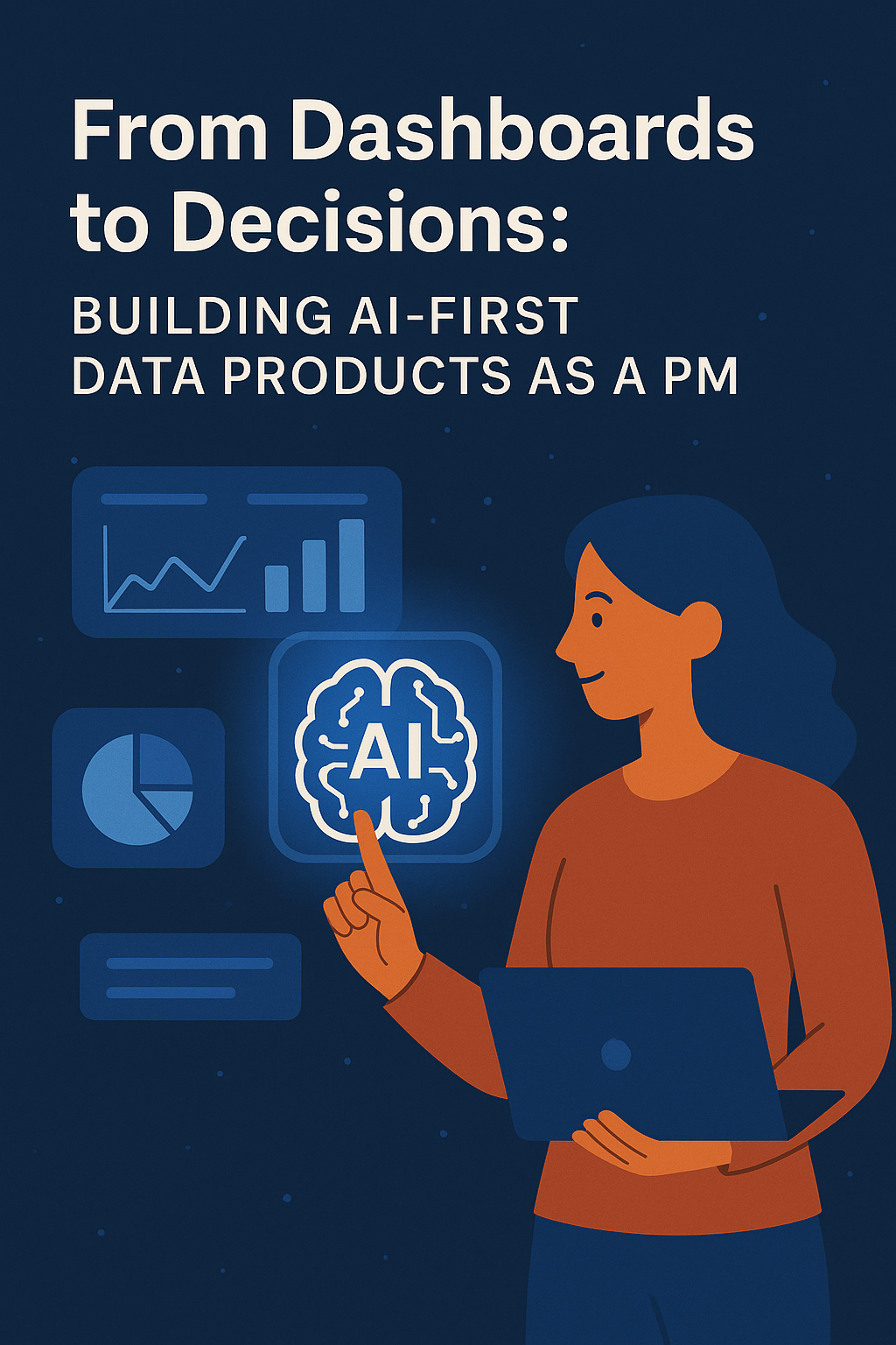
Image Credit: Medium
From Dashboards to Decisions: Building AI-First Data Products as a PM
- Traditional dashboards often fall short in delivering true business value, requiring users to interpret data.
- AI-first data products actively interpret data, surface insights, and recommend actions.
- Building AI-first data products requires PMs to expand their skill sets and responsibilities.
- Success in AI-first products requires balancing technical capabilities with human needs.
Read Full Article
12 Likes
VentureBeat
291

Image Credit: VentureBeat
$42.1 million poured into startup offering energy-efficient solutions for costly and unwieldy operational data and AI workloads
- Ocient, a hyperscale data warehouse vendor, has raised $42.1 million in funding to develop energy-efficient solutions for operational data and AI workloads.
- The funding raises Ocient's total funding to $159.4 million, with backing from investors like Blue Bear Capital and Allstate Strategic Ventures.
- Ocient's architecture promises significant price-performance gains on multi-petabyte workloads, with plans to expand into new verticals like automotive telemetry and climate modeling.
- The company has experienced revenue growth, doubled its revenues for three consecutive years, and appointed Henry Marshall as CFO to drive financial operations.
- Ocient's unique approach includes Compute-Adjacent Storage Architecture (CASA) and MegaLane, resulting in 10x price-performance gains on SQL and ML workloads.
- Efficiency is highlighted as a competitive advantage, with Ocient showcasing a 90% reduction in power, cost, and footprint in a telco stack case study.
- The company predicts growth in automotive sensor analytics and climate-intelligence modeling, aiming to reduce costs and enable more frequent risk analyses.
- Ocient positions itself as a high-volume structured analytics provider, focusing on efficiency and scalability against cloud leaders like Snowflake and Databricks.
- The platform allows deployment flexibility as software for on-premises clusters, managed service on public clouds, or through OcientCloud to meet data-sovereignty requirements.
- The fresh funding will support engineering headcount expansion and partner programs to further advance Ocient's efforts in energy-efficient analytics.
- Ocient's focus on transforming petabyte challenges into efficient solutions could reshape enterprise-scale data analytics in the era of data-driven AI.
Read Full Article
17 Likes
Medium
4

Image Credit: Medium
I Developed a Solution to Help My Friend Scale Her K-pop Merch Buying Business
- K-pop merch buying business involves selecting mystery boxes containing random items leading to specific challenges as the business scales.
- Buyers typically ask customers to list preferred items from a mystery box to ensure customer satisfaction as orders increase.
- Problems arise in assigning items to customers based on their preferences and optimizing additional purchases to fulfill unmet orders.
- The use of algorithms for assignment optimization like the maximum weight bipartite matching problem can help in achieving the best assignment.
- A simulation approach coupled with algorithms like the Hungarian algorithm aids in efficiently solving assignment problems.
- The simulation can estimate probabilities to improve outcomes based on potential items in mystery boxes, aiding decision-making.
- A developed solution using Google Apps Script and Google Sheets enhances operational efficiency and simplicity for managing the business.
- The entire project, including code implementation and a tutorial, is available in a GitHub repository for practical application and further enhancements.
- The solution offers a practical approach for addressing assignment and optimization challenges in the K-pop merch buying business.
- Google Apps Script and Sheets facilitate easy deployment and usage of the solution for business scalability and operational success.
Read Full Article
Like
Siliconangle
387

Image Credit: Siliconangle
Ocient raises $42.1M more for its speedy data analytics platform
- Ocient, a startup with a speedy data analytics platform, has raised $42.1 million in funding.
- The investment marks the second extension of the company's Series B round, with the total raised now at nearly $90 million.
- Ocient's platform allows analysis of historical and real-time data in one place, removing the need for multiple analytics environments.
- The platform offers high query performance, advanced compression methods, and managed environment options for customers.
Read Full Article
23 Likes
Medium
259

Introducing Signal Over Noise: a blog about data and data teams
- Introducing Signal Over Noise: a blog about data and data teams
- A blog sharing valuable lessons from the experience of building data products and leading analytics teams
- Includes tactical and reflective posts on data analysis, AI technology, and building high-performing analytics teams
- The blog aims to spark ideas and provide insights for those in the world of analytics, data engineering, or business intelligence
Read Full Article
15 Likes
Medium
218

Image Credit: Medium
Unit Testing in Python: A Practical Guide to Writing Reliable Code
- Unit testing involves testing the smallest parts of your code, such as functions, methods, or classes, in isolation.
- The unittest module uses the TestCase class as the foundation for writing tests.
- Unit testing is a critical skill for Python developers, enabling you to write reliable, maintainable code.
- Start incorporating unit tests into your projects today, and watch your code quality soar!
Read Full Article
13 Likes
TechBullion
146

Image Credit: TechBullion
Data Analytics Companies in The USA
- Data Analytics services in the USA are on the rise, with businesses leveraging data to predict trends and make informed decisions.
- Key players in the market include A-listware, a London-based IT outsourcing company with additional centers in Ukraine, Poland, and Romania.
- Teradata, headquartered in San Diego, specializes in cloud database and analytics software, assisting clients across industries with data integration and analysis.
- InData Labs, based in Cyprus, offers data science and AI solutions for companies seeking to extract valuable insights from large datasets.
- Indium, located in California, focuses on digital engineering and artificial intelligence, providing tailored solutions for enterprises.
- Itransition, an international IT company with headquarters in the USA, offers comprehensive digital transformation services, including cloud solutions and business analytics.
- ThirdEye Data, headquartered in California, specializes in AI, machine learning, and big data processing, aiding clients in building scalable data systems.
- Alteryx, based in California, develops software for data analytics, with a focus on automating analytics processes for data-driven decision-making.
- Blackburn Labs offers software and data literacy solutions for various industries, including healthcare, education, and real estate.
- Emergent Software, based in Minneapolis, provides software development and IT consulting services to address current business challenges and future demands.
Read Full Article
8 Likes
Medium
101
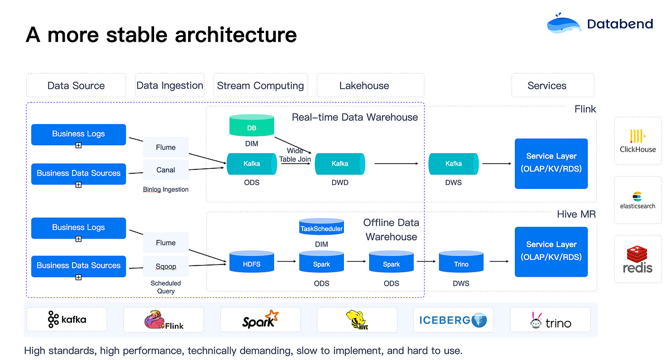
Image Credit: Medium
Unlocking 10x Revenue Growth with Data Analytics in Gaming
- Data engineers in the gaming industry face a high volume of demands, spending time on SQL, ad-hoc statistics, and exporting data.
- Data governance in gaming is complex, divided into web and client-based games, with challenges in understanding user behavior across different platforms and screen sizes.
- Games require real-time processing capabilities for enhancing player experience and retention, posing challenges for stream computing.
- Issues of task delays and queuing are prevalent in traditional big data teams, impacting business responsiveness.
- Databend focuses on massive data ingestion in real-time to improve business efficiency, emphasizing second-level data ingestion for timely processing.
- Databend simplifies data ingestion by linking directly to object storage, enabling efficient data loading and transformation at high speeds.
- Databend supports various data formats like CSV, TSV, JSON, and offers AI integration, aiming to streamline data processing tasks.
- Databend facilitates real-time processing through Table-level Change Data Capture (CDC) and external UDFs, optimizing data analysis and integration.
- Databend enhances complex JOIN operations, provides SQL IDE for visual query execution plans, and supports advanced data types like Array and Bitmap.
- Databend's storage-compute separation approach offers flexibility, optimized query performance, and support for hybrid cloud scenarios.
- High availability solutions in Databend Cloud leverage object storage replication for data synchronization and easy deployment across multiple data centers.
Read Full Article
6 Likes
Medium
296

Image Credit: Medium
Measuring Design ROI: Quantifying the Impact of UX in Large Organizations
- To connect design improvements to business outcomes, it's crucial to translate them into metrics that resonate with decision-makers.
- Design ROI involves aligning user experience metrics with business strategies that interest executives.
- Understanding the metrics that matter most to an organization is the foundation for measuring design impact.
- Revenue, efficiency, engagement, and strategic metrics are key areas to focus on when quantifying design ROI.
- Gathering data before implementing design changes is essential to demonstrate improvements.
- Articulating how design decisions impact key business metrics requires research and data-driven predictions.
- Design ROI can be measured across immediate, medium-term, and long-term impacts to track outcomes over time.
- Strategic communication of results plays a crucial role in presenting design ROI effectively.
- Qualitative elements like customer narratives, competitive positioning, and innovation potential complement quantitative data for a complete understanding of design impact.
- Challenges in measuring design ROI include attribution problems, balancing short-term and long-term thinking, and overreliance on quantitative data.
Read Full Article
17 Likes
Pymnts
344

Image Credit: Pymnts
80% of Gaming Firms Value Instant Market Data, but Few Have It
- A new report indicates that gaming platforms with dedicated analytics teams and real-time data access experience higher revenue growth compared to those lacking data-sharing policies.
- 95% of analytics-led gaming platforms report revenue growth, significantly higher than other consumer-facing sectors.
- Only 18% of gaming platforms currently have access to real-time market data, despite 80% considering it critical.
- The lack of real-time data is perceived as a cause of inaccurate decision-making and missed business opportunities by 80% of gaming platforms.
Read Full Article
20 Likes
For uninterrupted reading, download the app